
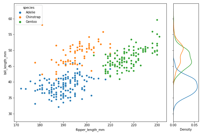
In this tutorial, we will see how to join or combine two plots with shared y-axis. As an example, we will make a scatterplot and join with with marginal density plot of the y-axis variable matching the variable colors. Thanks to Seaborn’s creator Michael Waskom’s wonderful tip on how to do this. 👉 Want more?… Continue reading How to Combine Two Seaborn plots with Shared y-axis
Category: Matplotlib
Matplotlib Draw Rectangle: Add, Fill, Annotate & Highlight Regions (Step-by-Step)


Need to highlight regions, create annotations, or add geometric shapes to your plots? This guide shows exactly how to draw rectangles in Matplotlib using patches.Rectangle—from crisp outlines to transparent overlays, labels, multiple boxes, subplots, and more. Copy-paste the code and adapt it to your data. Rectangles are ideal for highlighting clusters, marking thresholds/time windows, or… Continue reading Matplotlib Draw Rectangle: Add, Fill, Annotate & Highlight Regions (Step-by-Step)
How To Color Scatterplot by a variable in Matplotlib?

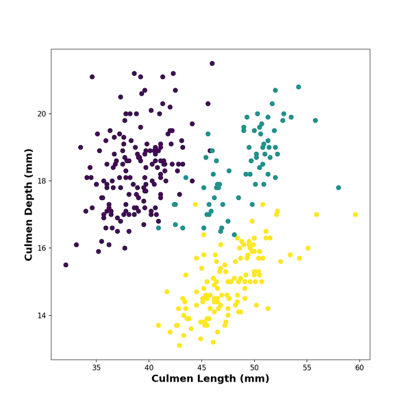
Scatterplots between two numerical variables are great to see the relationship between them. Adding colors to the data points based on the third categorical variable is often useful in understanding the relationship among the three variables. In this post, we will learn how to color data points in a scatterplot by a third categorical variable… Continue reading How To Color Scatterplot by a variable in Matplotlib?
How To Adjust Positions of Axis Labels in Matplotlib?

In this post, we will learn how to adjust positions of x-axis and y-axis labels in Matplotlib in Python. By default, plots with matplotlib places the axis labels in the middle. With matplotlib version 3.3.0, the matplotlib functions set_xlabel and set_ylabel have a new parameter “loc” that can help adjust the positions of axis labels.… Continue reading How To Adjust Positions of Axis Labels in Matplotlib?
How to Show and Customize Mean Values in Seaborn Boxplots

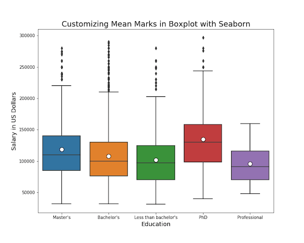
Want to display both median and mean values in your boxplot visualizations? This comprehensive guide shows you exactly how to seaborn boxplot show mean using multiple methods, with ready-to-use Python code examples. Boxplots traditionally show median values, but displaying the mean alongside provides additional statistical insight, especially when dealing with skewed distributions or comparing central… Continue reading How to Show and Customize Mean Values in Seaborn Boxplots