
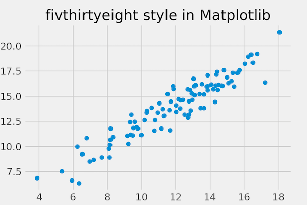
In this tutorial, we will learn how to change the background theme or style of a plot made with matplotlib. Matplotlib offers a number of ready to use styles to use for matplotlib plots. We will first learn how to find the available style options and then learn to set a matplotlib style of interest… Continue reading How to View All Matplotlib Plot Styles and Change
Category: Matplotlib
How To Add Dollar Sign on Axis Ticks in Matplotlib


In this tutorial, we will see examples of how to add dollar sign on axis ticks while making plots with Matplotlib in Python. While making plots to understand the relationship between currency like US dollars and other variables, it is better to show the Dollar symbol/sign on the axis ticks instead of numbers. Let us… Continue reading How To Add Dollar Sign on Axis Ticks in Matplotlib
How To Annotate Barplot with bar_label() in Matplotlib
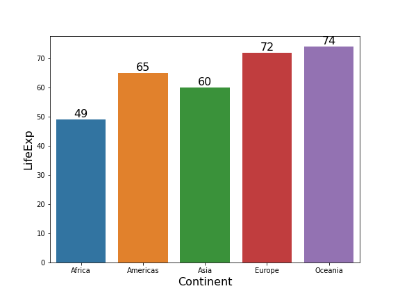
Annotating barplots with labels like texts or numerical values can be helpful to make the plot look better. Till now, one of the options add annotations in Matplotlib is to use pyplot’s annotate() function. Starting from Matplotlib version 3.4.2 and above, we have a new function, axes.bar_label() that lets you annotate barplots with labels easily.… Continue reading How To Annotate Barplot with bar_label() in Matplotlib
Connect Paired Data Points in a Scatter Plot in Python (Step-by-Step Guide)


Want to connect paired data points in a scatter plot using Matplotlib? This step-by-step tutorial shows you how to draw lines between paired observations so you can easily visualize before–after comparisons, longitudinal changes, and repeated-measures data. We cover four practical methods — a simple plot() + scatter() combo, looping through groups, efficient LineCollection rendering, and… Continue reading Connect Paired Data Points in a Scatter Plot in Python (Step-by-Step Guide)
How to Add Legend to Scatterplot Colored by a Variable with Matplotlib in Python

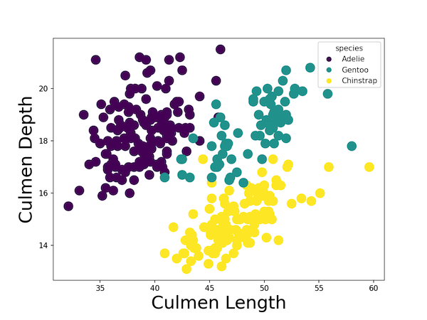
Matplotlib, one of the powerful Python graphics library, has many way to add colors to a scatter plot and specify legend. Earlier we saw a tutorial, how to add colors to data points in a scatter plot made with Matplotlib‘s scatter() function. In this tutorial, we will learn how to add right legend to a… Continue reading How to Add Legend to Scatterplot Colored by a Variable with Matplotlib in Python