
Want to connect paired data points in a scatter plot using Matplotlib? This step-by-step tutorial shows you how to draw lines between paired observations so you can easily visualize before–after comparisons, longitudinal changes, and repeated-measures data.
We cover four practical methods — a simple plot() + scatter() combo, looping through groups, efficient LineCollection rendering, and a Seaborn shortcut.
Each section includes Python code examples, visual outputs, best practices, so you can quickly learn how to create scatter plots with connecting lines.
In addition, we cover how to customize the scatter plot with lines by adding arrows to direction and highlight select lines. Whether you’re analyzing time series, experimental results, or country-level statistics, these techniques will help you tell a clearer data story with Matplotlib.
Check out:
- Matplotlib Hub – Core Python plotting library with tutorials on scatter, bars, histograms, heatmaps, time series, and styling.
Why connect paired points?
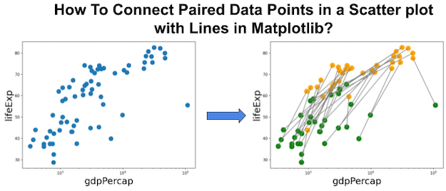
In many real-world datasets, we measure the same subject at two or more time points. A scatter plot by itself only shows static values, but connecting paired points with a line helps reveal changes over time and before–after differences. For example, tracking a country’s GDP and life expectancy across decades clearly shows whether progress was consistent or uneven. This method is widely used in clinical trials, economics, and social science research where paired comparisons matter. Matplotlib offers several efficient ways to draw these connections for small and large datasets.
TL;DR quickstart
If you are looking for a fast way to connect paired data points in a scatter plot, this minimal example is for you. It uses Matplotlib’s plot() function to draw gray connecting lines and scatter() to overlay colored markers. The example is based on Gapminder’s GDP and life expectancy data for Asian countries in 1952 and 2007. With only a few lines of Python code, you can highlight how each country has changed over time, making your scatter plots far more insightful.
import numpy as np
import pandas as pd
import matplotlib.pyplot as plt

# Data
url = "https://raw.githubusercontent.com/datavizpyr/data/master/gapminder-FiveYearData.csv"
gm  = pd.read_csv(url)
df  = gm.query('year in [1952, 2007] and continent == "Asia"').copy()

# Build paired coordinates (rows = years, cols = countries, same order)
x = np.vstack([df.query('year==1952').gdpPercap.values,
               df.query('year==2007').gdpPercap.values])
y = np.vstack([df.query('year==1952').lifeExp.values,
               df.query('year==2007').lifeExp.values])

plt.figure(figsize=(8,6))
plt.plot(x, y, color="lightgray", zorder=1)     # pairwise lines
colors = {1952: "tab:green", 2007: "tab:orange"}
plt.scatter(df.gdpPercap, df.lifeExp,
            s=60, c=df.year.map(colors), zorder=2)
plt.xscale("log")
plt.xlabel("GDP per capita (log)", size=16)
plt.ylabel("Life expectancy", size=16)
plt.title("Paired changes in Asia: 1952 → 2007", size=20)
plt.legend(handles=[
    plt.Line2D([0],[0], marker='o', linestyle='', color=colors[1952], label='1952'),
    plt.Line2D([0],[0], marker='o', linestyle='', color=colors[2007], label='2007')],
    title="Year", frameon=False)
plt.tight_layout()
plt.savefig("connect_paired_data_points_scatter_plot.png")
plt.show()

Data & setup
To demonstrate paired data visualization, we use the Gapminder dataset, which provides socioeconomic indicators across multiple countries and years. This dataset is perfect for scatter plots because it includes variables such as GDP per capita and life expectancy that show meaningful trends. In this tutorial, we filter the data to only include Asian countries in 1952 and 2007, creating natural before-and-after pairs. Using real-world data ensures that the visualizations are both realistic and reproducible. The dataset is available directly from GitHub, so you can load it in one line of Python code.
import numpy as np
import pandas as pd
import matplotlib.pyplot as plt

url = "https://raw.githubusercontent.com/datavizpyr/data/master/gapminder-FiveYearData.csv"
gapminder = pd.read_csv(url)

# Inspect
print(gapminder.head())

# Filter: two years for Asia and ensure consistent ordering for pairing
df = (
    gapminder
    .query('year in [1952, 2007] and continent == "Asia"')
    .sort_values(["country", "year"])
    .copy()
)

Method 1 — Simple plot+scatter
The most direct way to connect paired points in Matplotlib is by stacking coordinates into 2D arrays and passing them to plt.plot(). This draws a line segment between the two rows of data, making it ideal for before–after visualizations.
Overlaying plt.scatter() ensures the original points are visible and color-coded by year or condition.
This approach is simple, efficient, and works well for small to medium datasets. If your primary goal is clarity and quick implementation, this method should be your first choice.
# Build 2×N matrices: row 0 = 1952, row 1 = 2007 (ordered by country)
x_1952 = df[df.year==1952].gdpPercap.values
x_2007 = df[df.year==2007].gdpPercap.values
y_1952 = df[df.year==1952].lifeExp.values
y_2007 = df[df.year==2007].lifeExp.values

X = np.vstack([x_1952, x_2007])
Y = np.vstack([y_1952, y_2007])

plt.figure(figsize=(8,6))
plt.plot(X, Y, color="lightgray", lw=1.5, zorder=1)
cmap = {1952: "tab:green", 2007: "tab:orange"}
plt.scatter(df.gdpPercap,
            df.lifeExp,
            s=60,
            c=df.year.map(cmap),
            zorder=2)
plt.xscale("log")
plt.xlabel("GDP per capita (log)", size=16)
plt.ylabel("Life expectancy", size=16)
plt.title("Connecting paired points with lines (plot + scatter)", size=20)
plt.tight_layout();
plt.savefig("Connecting_paired_points_in_scatter_plot_with_lines_1.png")
plt.show()
Method 2 — Loop per group (explicit control)
If you need finer control over styling, looping through groups (e.g., one loop per country) provides flexibility. You can adjust line width, color, or alpha transparency for each entity independently. This method is especially useful when you want to highlight specific groups or handle missing data gracefully.
For example, you might want to emphasize only the top five countries that experienced the greatest improvement in life expectancy while keeping the rest in the background. Though slightly slower, the loop method makes customization straightforward.
plt.figure(figsize=(8,6))
for country, sub in df.groupby("country"):
    # Expect two rows: 1952 and 2007
    xs = sub.gdpPercap.values
    ys = sub.lifeExp.values
    plt.plot(xs, ys, color="lightgray", alpha=0.6, zorder=1)

plt.scatter(df.gdpPercap,
            df.lifeExp,
            s=60,
            c=df.year.map(cmap),
            zorder=2)
plt.xscale("log")
plt.xlabel("GDP per capita (log)", size=16)
plt.ylabel("Life expectancy", size=16)
plt.title("Loop per group for explicit control", size=20)
plt.tight_layout();
plt.savefig("Connecting_paired_points_in_scatter_plot_with_lines_using_loops.png")
plt.show()

Method 3 — LineCollection (fast & scalable)
When working with large datasets, the LineCollection class from Matplotlib’s collections module is the most efficient choice. Instead of plotting each line individually, you pass an array of line segments and render them in one call. This drastically improves performance when you have thousands of paired points, such as genetic expression data, user cohorts, or survey responses.
The LineCollection method also allows you to customize colors and line widths while keeping rendering fast. Use this approach when scalability and speed matter most.
from matplotlib.collections import LineCollection
import numpy as np

# Build segments as [[[x1,y1],[x2,y2]], ...]
pairs = []
for country, sub in df.groupby("country"):
    a = sub.iloc[0];
    b = sub.iloc[1]
    pairs.append([[a.gdpPercap, a.lifeExp],
                  [b.gdpPercap, b.lifeExp]])
segs = np.array(pairs)

fig, ax = plt.subplots(figsize=(8,6))
lc = LineCollection(segs, colors="lightgray", linewidths=1.5, zorder=1)
ax.add_collection(lc)

ax.scatter(df.gdpPercap, df.lifeExp, s=60, c=df.year.map(cmap), zorder=2)
ax.set_xscale("log")
plt.xlabel("GDP per capita (log)", size=16)
plt.ylabel("Life expectancy", size=16)
plt.title("Efficient rendering with LineCollection", size=20)
plt.tight_layout();
plt.savefig("Connecting_paired_points_in_scatter_plot_with_lines_using_LineConnection.png")
plt.show()

Method 4 — Seaborn shortcut
For those who prefer higher-level abstractions, Seaborn can draw one connecting line per entity using lineplot() with units="country" and estimator="None". The key detail: do not set hue="year" on the line layer, or Seaborn will split each country into separate hue groups (one point per group) and no lines will be drawn. Instead, draw the lines in a neutral color, then overlay a scatterplot with hue="year" so the points carry the color encoding.
import seaborn as sns
sns.set_theme(style="whitegrid")

plt.figure(figsize=(8,6))

# 1) Draw the connecting lines (one line per country)
#    - No hue here, or else each country gets split by year and lines vanish
sns.lineplot(
    data=df,
    x="gdpPercap", y="lifeExp",
    units="country", estimator=None,     # draw each country's line
    color="lightgray", lw=1.5, alpha=0.6
)

# 2) Overlay the points colored by year
palette = {1952: "tab:green", 2007: "tab:orange"}
sns.scatterplot(
    data=df,
    x="gdpPercap", y="lifeExp",
    hue="year", palette=palette, s=60, zorder=3
)

plt.xscale("log")
plt.xlabel("GDP per capita (log)", size=16)
plt.ylabel("Life expectancy", size=16)
plt.title("Seaborn lines per country + points colored by year", size=20)
plt.legend(title="Year", frameon=False)
plt.tight_layout()
plt.savefig("Connecting_paired_points_in_scatter_plot_with_Seaborn_lineplot_scatterplot.png")
plt.show()

Useful styling: direction arrows, labels, log scale
Beyond simply drawing lines, styling can make your paired scatter plots far more informative. Adding arrowheads indicates the direction of change (using FancyArrowPatch in Matplotlib), while labels help annotate key entities.
For datasets with a wide range of values, using a log scale on the x-axis spreads out small values and prevents overcrowding. These visual enhancements improve readability and storytelling, allowing viewers to immediately see which countries or individuals made the most progress. Good styling transforms a technical chart into a compelling narrative visualization.
from matplotlib.patches import FancyArrowPatch

fig, ax = plt.subplots(figsize=(8,6))
ax.plot(X, Y, color="gainsboro", zorder=1)
ax.scatter(df.gdpPercap, df.lifeExp, s=60, c=df.year.map(cmap), zorder=2)

# Add arrowheads for direction (1952 → 2007) with visible, point-sized heads
for country, sub in df.groupby("country"):
    a, b = sub.iloc[0], sub.iloc[1]
    arrow = FancyArrowPatch(
        (a.gdpPercap, a.lifeExp),
        (b.gdpPercap, b.lifeExp),
        arrowstyle="-|>",          # small triangular head
        mutation_scale=12,         # head size in points (adjust 8–14 as needed)
        color="gray",
        lw=0.8,
        alpha=0.85,
        zorder=2
    )
    ax.add_patch(arrow)

# Annotate largest increases in life expectancy
delta = (df[df.year==2007].set_index("country").lifeExp -
         df[df.year==1952].set_index("country").lifeExp)
top = delta.sort_values(ascending=False).head(5).index
for c in top:
    b = df[(df.country==c) & (df.year==2007)].iloc[0]
    ax.text(b.gdpPercap, b.lifeExp, c, fontsize=8, va="bottom")

ax.set_xscale("log")
ax.set_xlabel("GDP per capita (log)", size=16)
ax.set_ylabel("Life expectancy", size=16)
ax.set_title("Direction + labels for storytelling", size=20)
fig.tight_layout();
plt.savefig("Connecting_paired_points_in_scatter_plot_with_arrowheads_n_labels.png")
plt.show()

Useful styling: Highlight Select lines/pairs with LineConnection
One of the strengths of LineCollection is that you can mix a “background layer” of gray lines with a few highlighted entities. This avoids clutter while still letting the viewer see overall patterns. Below we plot all Asian countries in light gray, then re-draw just the top five countries with the largest gains in life expectancy in bold red lines. This storytelling technique shows both context and focus.
from matplotlib.collections import LineCollection

# Build segments for all countries
pairs = []
for country, sub in df.groupby("country"):
    a, b = sub.iloc[0], sub.iloc[1]
    pairs.append([[a.gdpPercap, a.lifeExp], [b.gdpPercap, b.lifeExp]])
segs = np.array(pairs)

fig, ax = plt.subplots(figsize=(8,6))
# Background lines in light gray
lc = LineCollection(segs,
                    colors="lightgray",
                    linewidths=1,
                    alpha=0.5,
                    zorder=1)
ax.add_collection(lc)

# Identify top 5 countries by life expectancy gain
delta = (df[df.year==2007].set_index("country").lifeExp -
         df[df.year==1952].set_index("country").lifeExp)
top5 = delta.sort_values(ascending=False).head(5).index

# Highlight selected lines
for c in top5:
    sub = df[df.country==c].sort_values("year")
    ax.plot(sub.gdpPercap,
            sub.lifeExp,
            color="crimson",
            lw=2.5,
            zorder=2,
            label=c)

# Points
ax.scatter(df.gdpPercap,
           df.lifeExp,
           s=40,
           c=df.year.map(cmap),
           zorder=3)

ax.set_xscale("log")
ax.set_xlabel("GDP per capita (log)", size=16)
ax.set_ylabel("Life expectancy", size=16)
ax.set_title("Highlighting select pairs with LineCollection", size=20)
ax.legend(frameon=False, fontsize=8, loc="lower right")
fig.tight_layout();
plt.savefig("Connecting_paired_points_in_scatter_plot_n_highlight_select_lines.png")
plt.show()

Common pitfalls & fixes
Beginners often run into issues when connecting paired data points. One common mistake is mismatching pairs due to incorrect sorting, which results in lines connecting the wrong entities. Another challenge is “spaghetti plots,” where too many overlapping lines make the visualization unreadable. To solve this, use transparency, lighter colors, or selectively highlight important groups. Scaling is also critical — without log transformations, large values can dominate the plot. By being mindful of these pitfalls, you can ensure your paired scatter plots remain accurate and insightful.
- Mis-paired lines: Ensure consistent sort by entity and year before stacking arrays, or loop by group.
-
Overplotting (“spaghetti”): Use light gray,
alpha<1, smaller linewidth; highlight only a few entities with color/labels. -
Scale mismatch: Many economic variables benefit from
logscale on x to spread low values. -
Performance: Prefer
LineCollectionfor thousands of pairs. - Legend clarity: Add an explicit legend for time points (e.g., 1952 vs 2007 colors).
Related reading
Keep exploring paired/longitudinal visuals and scatter enhancements on the site:
Frequently Asked Questions
How can I show before-and-after comparisons in Matplotlib scatter plots?
Before-and-after comparisons can be shown by connecting paired points with line segments.
Each subject or country gets a small line showing movement from time A to time B.
This approach is especially effective in visualizing clinical trials, survey responses, or
longitudinal socioeconomic data. Pairing dots with lines makes changes intuitive and easy to spot.
What’s the difference between a scatter plot with lines and a line chart?
A scatter plot with connecting lines emphasizes paired or repeated measures for entities,
while a line chart typically shows continuous trends across ordered categories (like time series). Scatter + lines is best for comparing two or three discrete points per subject, while line charts work when measurements exist across many intervals. Mixing the two approaches may confuse viewers.
How do I handle overlapping lines in paired scatter plots?
Overlapping lines are common in paired data visualizations, especially with large datasets. To improve clarity, use transparency (alpha), lighter line colors, or smaller markers. You can also highlight a subset of important entities in bold colors while keeping the rest in the background. This storytelling technique avoids clutter and focuses attention on the key insights.
Is there a way to add direction to the connections between points?
Yes, you can add directionality by plotting arrowheads instead of plain line segments.
Matplotlib’s arrow(), annotate(), or FancyArrowPatch (shown above) functions allow you to indicate the flow from an initial measurement to the final one. Adding arrows helps audiences immediately understand
which way change is happening, making the visualization more informative.


