
Matplotlib, one of the powerful Python graphics library, has many way to add colors to a scatter plot and specify legend. Earlier we saw a tutorial, how to add colors to data points in a scatter plot made with Matplotlib‘s scatter() function. In this tutorial, we will learn how to add right legend to a scatter plot colored by a variable that is part of the data.
Let us load Pandas and Matplotlib’s pyplot.
import pandas as pd
import matplotlib.pyplot as plt
We will use Palmer penguins data for making the scatter plot. We have the penguins data on datavizpyr.com’s github page.
penguins_data="https://raw.githubusercontent.com/datavizpyr/data/master/palmer_penguin_species.tsv"
# load penguns data with Pandas read_csv
df = pd.read_csv(penguins_data, sep="\t")
Here we remove any missing data using Pandas’ dropna() function.
df = df.dropna()
df.head()
	species	island	culmen_length_mm	culmen_depth_mm	flipper_length_mm	body_mass_g	sex
0	Adelie	Torgersen	39.1	18.7	181.0	3750.0	MALE
1	Adelie	Torgersen	39.5	17.4	186.0	3800.0	FEMALE
2	Adelie	Torgersen	40.3	18.0	195.0	3250.0	FEMALE
4	Adelie	Torgersen	36.7	19.3	193.0	3450.0	FEMALE
5	Adelie	Torgersen	39.3	20.6	190.0	3650.0	MALE
First, let us get started by making a scatterplot using Matplotlib’s scatter function. We use “c” argument in scatter() function to color data points by species variable in the dataframe.
plt.figure(figsize=(8,6))
plt.scatter(df.culmen_length_mm,
            df.culmen_depth_mm,
            s=150,
            c=df.species.astype('category').cat.codes)
plt.xlabel("Culmen Length", size=24)
plt.ylabel("Culmen Depth", size=24)
plt.savefig("scatterplot_point_colored_by_variable_matplotlib_Python.png",
                    format='png',dpi=150)
Note that the scatter plot colored by a variable is missing legend to describe the meaning of the clusters we see.

Adding legend to Matplotlib scatte plot
We can try to add legend to the scatterplot colored by a variable, by using legend() function in Matplotlib. In legend(), we specify title and handles by extracting legend elements from the plot.
plt.figure(figsize=(8,6))
scatter = plt.scatter(df.culmen_length_mm,
            df.culmen_depth_mm,
            s=150,
            c=df.species.astype('category').cat.codes)
plt.xlabel("Culmen Length", size=24)
plt.ylabel("Culmen Depth", size=24)
# add legend to the plot with names
plt.legend(handles=scatter.legend_elements()[0],
           title="species")
plt.savefig("scatterplot_colored_by_variable_legend_first_try_matplotlib_Python.png",
                    format='png',dpi=150)
Our first attempt to add legends did not work well. We can see that we have a legend with colors but not the variable names.

We did not get legend labels mainly because, we colored the scatterplot using numerical code for the species variable. Note, we use “df.species.astype(‘category’).cat.codes” to color the data points.
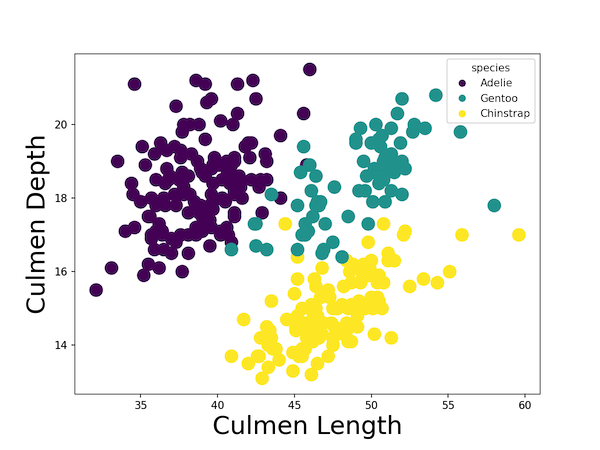
We can maually specify labels for legend using Matplotlib’s legend() function’s argument “labels”. We define labels using a list of species names first.
plt.figure(figsize=(8,6))
sp_names = ['Adelie', 'Gentoo', 'Chinstrap']
scatter = plt.scatter(df.culmen_length_mm,
            df.culmen_depth_mm,
            s=150,
            c=df.species.astype('category').cat.codes)
plt.xlabel("Culmen Length", size=24)
plt.ylabel("Culmen Depth", size=24)
# add legend to the plot with names
plt.legend(handles=scatter.legend_elements()[0],
           labels=sp_names,
           title="species")
plt.savefig("scatterplot_colored_by_variable_with_legend_matplotlib_Python.png",
                    format='png',dpi=150)
Now we have legend for scatterplot colored by a variable.


1 comment
Comments are closed.