In this tutorial, we will learn how make bar plots with rounded edges in ggplot. We will use ggplot2 extension package called ggchicklet developed by the fantastic R developer boB Rudis/hrbrmstr.
Let us get started by installing ggchicklet and loading tidyverse.
remotes::install_git("https://git.sr.ht/~hrbrmstr/ggchicklet")
library(ggchicklet)
packageVersion(ggchicklet)

## [1] '0.5.2'
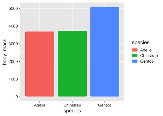
We have installed ggchicklet version 0.5.2. Let us quickly generate data for making a simple barplot. We use palmer penguins data set to compute average body mass per species.
df <- penguins %>%
  group_by(species) %>%
  summarize(body_mass=mean(body_mass_g, na.rm=TRUE))

df
## # A tibble: 3 × 2
##   species   body_mass
##   <fct>         <dbl>
## 1 Adelie        3701.
## 2 Chinstrap     3733.
## 3 Gentoo        5076.
And we will this simple data and make barplot using geom_col().
df %>%
  ggplot(aes(x=species, y=body_mass, fill=species))+
  geom_col()
ggsave("barplot_ggplot.png")
As one can barplots made with ggplot2 has rectangle edges.
As Bod Rudis puts it
Sometimes it is useful to stylize column charts a bit more than just bland rectangles.
ggchicklet, a ggplot2 extension package has geom_chicklet() that makes rounded edge bars. We use default grey background to highlight the white line highlighted around the bars by ggchicklet..
df %>%
  ggplot(aes(x=species, y=body_mass, fill=species))+
  geom_chicklet()
If we are interested in making horizontal barplot with rounded bars, we can not use ggplot2 v2.3 feature of swapping x and y axes. This would give the following error.
df  %>%
  ggplot(aes(x=body_mass, y=species, fill=species))+
  geom_chicklet()
## Warning: Stacking not well defined when not anchored on the axis
## Warning: position_stack requires non-overlapping x intervals
However, we can use coord_flip() to make the horizontal barplots with rounded edges.
df  %>%
  ggplot(aes(x=species, y=body_mass, fill=species))+
  geom_chicklet()+
  coord_flip()
