
Introduction: Understanding and Visualizing the Binomial Distribution in R
The binomial distribution is one of the most common discrete probability distributions in statistics. It models the number of successes in n independent Bernoulli trials, each with the same probability of success p.
The classic example of binomial distribution is tossing a coin n times and counting the number of heads (successes) for a coin that is fair or biased.
Other examples of same flavor include, yes/no survey responses, or defect counts in manufacturing. In this tutorial, we’ll explore how to compute probabilities with dbinom() in R, visualize the probability mass function (PMF) and cumulative distribution function (CDF), simulate outcomes with rbinom(), understand how changing parameters affects the shape of the distribution, and normal distribution approximation
library(tidyverse)
theme_set(theme_bw(16))
1. Compute Binomial Probabilities with dbinom()
The function dbinom(x, size, prob) gives the probability of exactly x successes in size trials with success probability prob.
dbinom(5, size = 10, prob = 0.5)
## [1] 0.2460938
Here we have a 24.6% chance of obtaining exactly 5 heads when tossing a fair coin 10 times. The probability of getting all 10 heads is extremely small:
dbinom(10, size = 10, prob = 0.5)
## [1] 0.0009765625
2. Visualize Binomial Distribution as a Line Plot
n = 10
p = 0.5

binom_prob_df
  mutate(prob = dbinom(n_success, size = n, prob = p))

binom_prob_df  |> head()

n_success prob
0	0.0009765625
1	0.0097656250
2	0.0439453125
3	0.1171875000
4	0.2050781250
5	0.2460937500
6 rows
The bar chart version of the above data makes it easier to compare individual probabilities. Each bar represents the likelihood of achieving a specific number of successes.
binom_prob_df |>
  ggplot(aes(x = n_success, y = prob)) +
  geom_line(color = "#3182BD", linewidth = 1) +
  geom_point(size = 2, color = "#08519C") +
  scale_x_continuous(breaks = 0:n) +
  labs(
    x = "Number of Successes (k)",
    y = "Probability P(X = k)",
    title = paste0("Binomial Distribution PMF: n = ", n, ", p = ", p)
  )
ggsave("binomial_distribution_line_plot.png")

For example, in 10 coin tosses, the bar for getting 5 heads is the tallest (probability ≈ 0.25), followed by the bars for 4 and 6 heads (each ≈ 0.20). Extreme outcomes such as 0 or 10 heads have almost negligible height, confirming how rare they are.

Because the coin is fair, the bar plot is perfectly symmetric around 5, visually reinforcing the balance between heads and tails. For p = 0.5, the distribution is symmetric around n × p = 5. As you move away from the center, probabilities decrease quickly, forming a discrete “bell curve”.
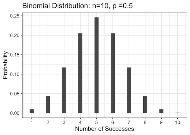
3. Visualize Binomial Distribution as a Bar Plot
The bar chart version of the same data makes it easier to compare individual probabilities. Each bar represents the likelihood of achieving a specific number of successes. For example, in 10 coin tosses, the bar for getting 5 heads is the tallest (probability ≈ 0.25), followed by the bars for 4 and 6 heads (each ≈ 0.20).
Extreme outcomes such as 0 or 10 heads have almost negligible height, confirming how rare they are. Because the coin is fair, the bar plot is perfectly symmetric around 5, visually reinforcing the balance between heads and tails.
binom_prob_df |>
  ggplot(aes(x = n_success, y = prob)) +
  geom_col(fill = "#6BAED6", width = 0.4) +
  scale_x_continuous(breaks = 0:n) +
  labs(
    x = "Number of Successes",
    y = "Probability",
    title = paste0("Binomial PMF (Bar Plot): n = ", n, ", p = ", p)
  )
The center bar at 5 is the tallest, confirming that five successes are most likely when p = 0.5.

The bar chart version is excellent for presentations because it clearly shows individual probabilities for discrete outcomes.

4. Compare Fair vs Biased Coin
In the previous example p=0.5 represented a fair coin toss experiment. When the coin is biased toward heads (p = 0.7), the distribution becomes skewed to the right — higher numbers of successes become more probable.
For instance, in 10 tosses, getting exactly 7 heads is now the most likely outcome (probability ≈ 0.27), while the probability of 3 or fewer heads is very small (less than 2%). The peak shifts from 5 to 7, illustrating how bias toward success moves the center of the distribution and changes its shape from symmetric to right-skewed.
# Biased coin with p = 0.7
p
  mutate(prob = dbinom(n_success,
                       size = n,
                       prob = p))
binom_prob_df2 |>
  head()
binom_prob_df2 |>
  ggplot(aes(x = n_success, y = prob)) +
  geom_col(fill = "#9ECAE1", width = 0.4) +
  scale_x_continuous(breaks = 0:n) +
  labs(
    x = "Number of Successes",
    y = "Probability",
    title = paste0("Binomial Distribution: n = ", n, ", p = ", p)
  )
ggsave("binomial_distribution_biased_coin_PMF_barplot_plot.png",
       width=6, height=4)
Most of the probability mass shifts toward higher numbers of successes (e.g., 7 or 8 heads). This skewness shows how bias in success probability changes the distribution’s shape.

5. Visualize the Cumulative Distribution Function (CDF) with pbinom()
While dbinom() gives individual probabilities, pbinom() provides cumulative probabilities — the probability of obtaining up to a certain number of successes.
p_cdf
  mutate(cum_prob = pbinom(n_success,
                           size = n,
                           prob = 0.5))

p_cdf |>
  head()

n_success. cum_prob
0	0.0009765625
1	0.0107421875
2	0.0546875000
3	0.1718750000
4	0.3769531250
5	0.6230468750
p_cdf |>
  ggplot(aes(x = n_success, y = cum_prob)) +
  geom_step(linewidth = 1, color = "#3182BD") +
  geom_point(size = 2, color = "#08519C") +
  scale_x_continuous(breaks = 0:n) +
  scale_y_continuous(labels = scales::percent_format()) +
  labs(
    x = "Number of Successes (k)",
    y = "Cumulative Probability P(X ≤ k)",
    title = "Cumulative Binomial Distribution (CDF)"
  )
ggsave("binomial_distribution_CDF.png")
The CDF plot rises from 0 to 1, showing how probability accumulates as k increases. For example, the probability of getting 5 or fewer heads in 10 tosses is pbinom(5, 10, 0.5) ≈ 0.623. The step shape reflects the discrete nature of the binomial variable.


6. Simulate Random Outcomes with rbinom()
Simulation helps verify theoretical probabilities. The rbinom() function generates random draws from the binomial distribution.
set.seed(123)
sim_df  head()

sample
4
6
5
7
7
2
sim_df |>
  ggplot(aes(x = sample)) +
  geom_histogram(binwidth = 1,
                 fill = "#74C476",
                 color = "white") +
  scale_x_continuous(breaks = 0:10) +
  labs(
    x = "Number of Successes in 10 Trials",
    y = "Frequency (out of 10,000)",
    title = "Simulated Binomial Distribution (rbinom)"
  )
ggsave("simulating_binomial_distribution_rbinom.png")


Tutorial insight: Out of 10,000 simulated experiments, results cluster near 5, mirroring the theoretical PMF. This approach is great for Monte Carlo simulations and verifying analytical formulas empirically.
Real-World Example: Quality Control and Defect Probability
The binomial distribution isn’t just a theoretical concept — it’s widely used in real-world decision making. One practical example is manufacturing quality control. Suppose a factory produces electronic components, and each component has a 2% chance of being defective (p = 0.02). Inspectors randomly test n = 20 items from a day’s production. We can use the binomial distribution to estimate the probability of finding a certain number of defective items in the sample.
# number of items tested
n
This table shows the likelihood of observing 0, 1, 2, … up to 5 defective parts in the sample. For example, the probability of finding no defects in 20 items is dbinom(0, 20, 0.02) ≈ 0.67, while the chance of finding exactly one defect is about 0.27. The probability of finding two or more defects is very small, which aligns with a well-controlled manufacturing process.
# Visualize probabilities with a bar plot
defect_df |>
  ggplot(aes(x = defective_items, y = probability)) +
  geom_col(fill = "#74C476", width = 0.4) +
  scale_x_continuous(breaks = 0:5) +
  scale_y_continuous(labels = scales::percent_format()) +
  labs(
    title = paste0("Binomial Distribution for Defects (n = ", n, ", p = ", p, ")"),
    x = "Number of Defective Items in Sample",
    y = "Probability"
  ) +
  theme_bw(base_size = 14)
The bar chart shows that most samples contain zero or one defect, which is expected when the defect rate is low. Managers can use this information to set acceptable quality thresholds — for instance, flagging a batch as “high risk” if more than two defective units are found.
Real-World Example 2: Marketing Conversion and A/B Testing
The binomial distribution is also essential in digital marketing and A/B testing.
Imagine running an online ad campaign where each visitor either converts (makes a purchase) or not — a perfect yes/no scenario.
Suppose 200 users see an ad, and historically about 8% (p = 0.08) of visitors convert.
We can use the binomial distribution to estimate the probability of getting a certain number of conversions (successes) out of those 200 visitors.
# number of visitors
n %
  ggplot(aes(x = conversions, y = probability)) +
  geom_col(fill = "#6BAED6", width = 0.6) +
  scale_y_continuous(labels = scales::percent_format()) +
  labs(
    title = paste0("Binomial Distribution: Conversions (n = ", n, ", p = ", p, ")"),
    x = "Number of Conversions",
    y = "Probability"
  ) +
  theme_bw(base_size = 14)
The bar chart shows that the most likely number of conversions lies near n × p = 16.
For instance, the probability of observing exactly 15 conversions is about 10%, and the chance of 20 or more conversions is small (≈4%).
This visualization helps marketers understand expected performance variation — even if your conversion rate is stable, the number of actual sales fluctuates naturally due to random chance.
Comparing Two Campaigns with the Binomial Model
# Campaign A: conversion rate 8%
# Campaign B: conversion rate 10%

n %
  pivot_longer(cols = everything(), names_to = "Campaign", values_to = "Conversions") %>%
  ggplot(aes(x = Conversions, fill = Campaign)) +
  geom_histogram(position = "identity", alpha = 0.5, binwidth = 1) +
  labs(
    title = "Simulated Conversion Distributions (A/B Test)",
    x = "Conversions out of 200",
    y = "Frequency (10,000 simulations)"
  ) +
  theme_bw(base_size = 14)
This simulation uses rbinom() to generate random outcomes from two campaigns with slightly different conversion rates.
Campaign B (10%) consistently yields higher counts, but the distributions overlap — meaning short-term tests may show random differences even if the true lift is small.
Marketers and data scientists use such binomial modeling to estimate statistical significance and determine whether a new design or ad truly outperforms the old one.
Understanding the binomial distribution is key for anyone analyzing conversion rates, email open rates, or click-through success. With dbinom(), pbinom(), and rbinom(), you can quantify expected variation, simulate A/B test results, and visualize uncertainty — all inside tidyverse workflows.
FAQs
What are dbinom, pbinom, and rbinom used for?
dbinom() returns the exact probability of k successes, pbinom() gives the cumulative probability up to k, and rbinom() generates random samples.
When can the binomial be approximated by a normal distribution?
When n is large and p is not too close to 0 or 1 (both n×p and n×(1−p) ≥ 5).
Can I plot multiple binomial curves in one chart?
Yes, use expand_grid() to generate combinations of parameters and facet_wrap() or color aesthetics to visualize differences.


