• Skip to primary navigation
  • Skip to main content
  • Skip to primary sidebar

Data Viz with Python and R

Learn to Make Plots in Python and R

  • Home
  • Python Viz
  • Seaborn
  • Altair
  • R Viz
  • ggplot2
  • About
    • Privacy Policy
  • Show Search
Hide Search

3 Different ways to make bar plots with ggplot2

datavizpyr · July 17, 2024 ·

In this post, we will see three different ways to make a barplot with count on y-axis in ggplot2. We will show how to make bar plot using geom_bar(), stat_count(), and geom_col() functions available in ggplot2

library(tidyverse)
theme_set(theme_bw(16))
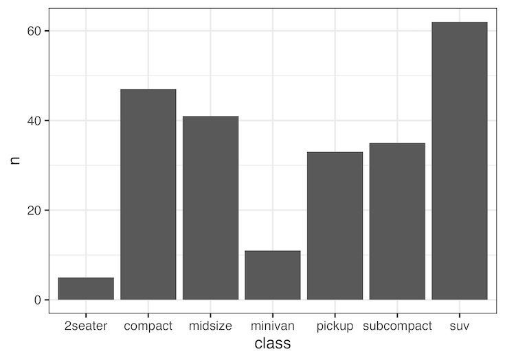
mpg |> head()

# A tibble: 6 × 11
  manufacturer model displ  year   cyl trans      drv     cty   hwy fl    class 
  <chr>        <chr> <dbl> <int> <int> <chr>      <chr> <int> <int> <chr> <chr> 
1 audi         a4      1.8  1999     4 auto(l5)   f        18    29 p     compa…
2 audi         a4      1.8  1999     4 manual(m5) f        21    29 p     compa…
3 audi         a4      2    2008     4 manual(m6) f        20    31 p     compa…
4 audi         a4      2    2008     4 auto(av)   f        21    30 p     compa…
5 audi         a4      2.8  1999     6 auto(l5)   f        16    26 p     compa…
6 audi         a4      2.8  1999     6 manual(m5) f        18    26 p     compa…

Bar plot with geom_bar()

mpg |>
  ggplot(aes(x=class))+
  geom_bar()
How to make barplot with stat_count()

Bar plot with stat_count()

mpg |>
  ggplot(aes(x=class))+
  stat_count(geom="bar")
How to make barplot with geom_bar()

Bar plot with geom_col()

mpg |>
  count(class) |>
  ggplot(aes(x=class, y =n))+
  geom_col()
How to make barplot with geom_col()

Related posts:

Correctly align annotation on a horizontal barplot with both negative and positive valuesHow to Annotate Positive and Negative Values in a barplot Stacked Barplots Side By Side with ggplot2 in RHow to Make Horizontal Stacked Barplots with ggplot2 in R? Default ThumbnailHow to Move Facet strip label to the bottom Default ThumbnailHow to change axis tick label size in ggplot2

Filed Under: barplot ggplot2, ggplot2, R Tagged With: barplot with geom_bar(), barplot with geom_col(), barplot with stat_count()

Primary Sidebar

Tags

Altair barplot Boxplot boxplot python boxplot with jiitered text labels Bubble Plot Color Palette Countplot Density Plot Facet Plot gganimate ggplot2 ggplot2 Boxplot ggplot2 error ggplot boxplot ggridges ggtext element_markdown() Grouped Barplot R heatmap heatmaps Histogram Histograms Horizontal boxplot Python lollipop plot Maps Matplotlib Pandas patchwork pheatmap Pyhon Python R RColorBrewer reorder boxplot ggplot Ridgeline plot Scatter Plot Scatter Plot Altair Seaborn Seaborn Boxplot Stock Price Over Time Stripplot UpSetR Violinplot Violin Plot World Map ggplot2

Buy Me a Coffee

Copyright © 2025 · Daily Dish Pro on Genesis Framework · WordPress · Log in

Go to mobile version