
A well made table showing the summary of the data is under utilized. gt() package available as part of tidyverse improves the look of a table and makes it easy to read and understand. If you think gt is cool, wait until you see the work of Thomas Mock. Thomas Mock has created the fantastic… Continue reading How to Make Beautiful Tables with gtExtras
Author: datavizpyr
Side by side plots with ggplot2 using gridExtra

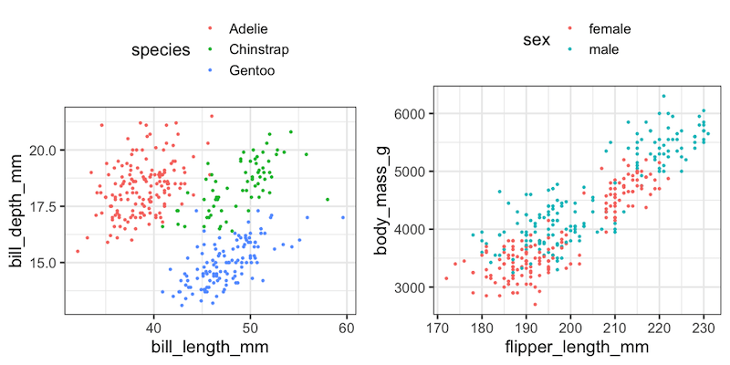
In this tutorial, we will learn how to place two plots made with ggplot2 side by side. In R, we have multiple solutions to combine plots into a single plot. Here, we will use R Package gridExtra’s function grid.arrange to combine two plots side by side. Firs, let us load the packages needed and palmer… Continue reading Side by side plots with ggplot2 using gridExtra
How to Make Axis Title Bold Font with ggplot2

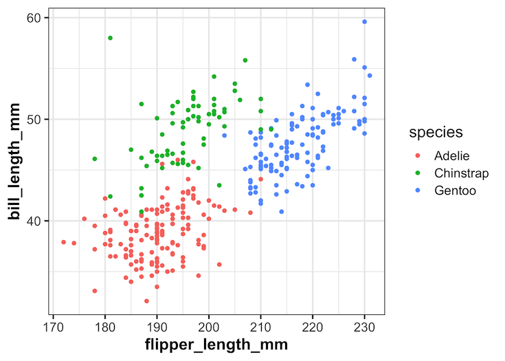
In this tutorial, we will learn how to change the axis title bold font with ggplot2 in R. Let us load the packages needed including tidyverse and palmerpenguins for penguins data. A plot with default font for axis title text Let us make a simple scatter plot using ggplot2 to see how the default font… Continue reading How to Make Axis Title Bold Font with ggplot2
How to Make Axis Text Bold in ggplot2
In this tutorial, we will learn how to make the axis text bold in a plot made with ggplot2 in R. Axis text in a plot refers to the text annotating the tick marks on x and y-axis. By default the axis text around tick marks are not in bold font and here we will… Continue reading How to Make Axis Text Bold in ggplot2
How To Add Mean/Median Line to a Seaborn Displot

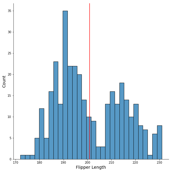
In this tutorial, we will learn how to add mean or median vertical line to a plot made with Seaborn’s displot() function. Seaborn’s displot() offers capability to visualize the univariate or bivariate distribution of data. Here we will make a histogram with Seaborn’s displot() and then see how to add median line to the histogram,… Continue reading How To Add Mean/Median Line to a Seaborn Displot