• Skip to primary navigation
  • Skip to main content
  • Skip to primary sidebar

Data Viz with Python and R

Learn to Make Plots in Python and R

  • Home
  • Seaborn
  • Matplotlib
  • ggplot2
  • Altair
  • About
    • Privacy Policy
  • Visualizing Activation Functions in Neural Networks
  • Confusion Matrix Calculator
  • Visualizing Dropout Rate in Neural Network
  • Visualizing Loss Functions in Neural Networks
  • Show Search
Hide Search

3 Different ways to make bar plots with ggplot2

datavizpyr · July 17, 2024 ·

Last updated on August 17, 2025

Creating effective bar plots in ggplot2 requires knowing which function to use for your data structure. This comprehensive guide demonstrates three essential approaches—geom_bar() for raw data, geom_col() for summarized values, and stat_count() for explicit control—with practical R code examples you can immediately apply to your own datasets.”

library(tidyverse)
theme_set(theme_bw(16))
mpg |> head()

# A tibble: 6 × 11
  manufacturer model displ  year   cyl trans      drv     cty   hwy fl    class 
  <chr>        <chr> <dbl> <int> <int> <chr>      <chr> <int> <int> <chr> <chr> 
1 audi         a4      1.8  1999     4 auto(l5)   f        18    29 p     compa…
2 audi         a4      1.8  1999     4 manual(m5) f        21    29 p     compa…
3 audi         a4      2    2008     4 manual(m6) f        20    31 p     compa…
4 audi         a4      2    2008     4 auto(av)   f        21    30 p     compa…
5 audi         a4      2.8  1999     6 auto(l5)   f        16    26 p     compa…
6 audi         a4      2.8  1999     6 manual(m5) f        18    26 p     compa…

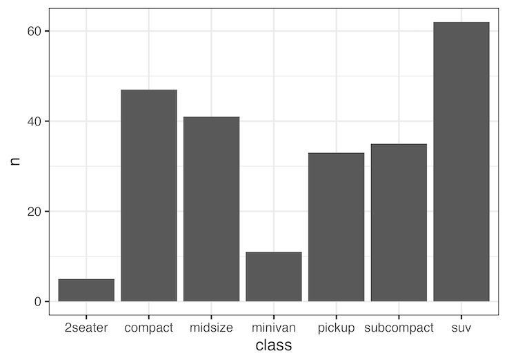
Bar plot with geom_bar()

mpg |>
  ggplot(aes(x=class))+
  geom_bar()
How to make barplot with stat_count()

Bar plot with stat_count()

mpg |>
  ggplot(aes(x=class))+
  stat_count(geom="bar")
How to make barplot with geom_bar()

Bar plot with geom_col()

mpg |>
  count(class) |>
  ggplot(aes(x=class, y =n))+
  geom_col()
How to make barplot with geom_col()

When to Use Each ggplot2 Bar Plot Function

geom_bar()

Raw Data

Use when: You have individual observations and want ggplot2 to automatically count occurrences.

Perfect for: Survey responses, categorical data like car types, exploring frequency distributions

Data example: A column with “SUV”, “compact”, “SUV”, “midsize” → automatically counts each type

geom_col()

Pre-calculated Data

Use when: Your data already contains the values you want to plot (heights of bars).

Perfect for: Sales by region, population by country, any pre-summarized data

Data example: Region A = 100 sales, Region B = 150 sales → plot these exact values

stat_count()

Same as geom_bar()

Use when: You want the same result as geom_bar() but prefer explicit control over the statistical transformation.

Perfect for: When teaching R code, documenting statistical transformations explicitly

Note: Functionally identical to geom_bar() – use whichever you prefer

Quick Reference

📊 Have individual data points? → Use geom_bar()
📈 Have calculated totals/averages? → Use geom_col()
🎯 Want explicit statistical control? → Use stat_count()

🤔 Not Sure Which to Use?

Start with geom_bar() for raw data or geom_col() for summary data

Explore the Complete ggplot2 Guide

35+ tutorials with code: scatterplots, boxplots, themes, annotations, facets, and more—tested and beginner-friendly.

Visit the ggplot2 Hub → No fluff—just code and visuals.

Related posts:

Wrapping or Folding long axis tick labels in a ggplot into multiple linesHow to wrap long axis tick labels into multiple lines in ggplot2 Correctly align annotation on a horizontal barplot with both negative and positive valuesHow to Annotate Positive and Negative Values in a barplot Stacked Barplots Side By Side with ggplot2 in RHow to Make Horizontal Stacked Barplots with ggplot2 in R? Customizing Mean mark to boxplot with ggplot2How To Show Mean Value in Boxplots with ggplot2?

Filed Under: barplot ggplot2, ggplot2, R Tagged With: barplot with geom_bar(), barplot with geom_col(), barplot with stat_count()

Primary Sidebar

Python & R Viz Hubs

  • Seaborn Guide & Cookbook
  • ggplot2 Guide & Cookbook
  • Matplotlib Guide & Cookbook
  • Confusion Matrix Calculator
  • Visualizing Activation Functions
  • Visualizing Dropout
  • Visualizing Loss Functions

Buy Me a Coffee

Copyright © 2026 · Daily Dish Pro on Genesis Framework · WordPress · Log in

Go to mobile version