In this tutorial, we will learn how to visualize binomial distribution in R. Binomial Distribution is one of the useful discrete probability distributions that comes handy in modelling problems in a number of scenarios.
The classic example of binomial distribution is tossing a coin n times and counting the number of heads (successes) for a coin that is fair or biased. Binomial distribution can help us in computing/estimating the probability of having k successes. And visualizing binomial distribution and understanding the shape of the distribution is useful.
library(tidyverse)
theme_set(theme_bw(16))
In R, we can readily compute probability mass function using dbinom() function. We need to specify the number of trials (size), probability of success (p). In the coin toss experiment where tossing a coin 10 times with a fair coin, size= 10 and p = 0.5. And we can compute the probability of getting 5 successes as shown below. We can see that we have about 25% probability of getting 5 successes when tossing a fair coin 10 times.
dbinom(5, size=10, prob=0.5)

## [1] 0.2460938
The probability is negligent if we are interested in 10 successes out 10 tosses.
dbinom(10, size=10, prob=0.5)

## [1] 0.0009765625
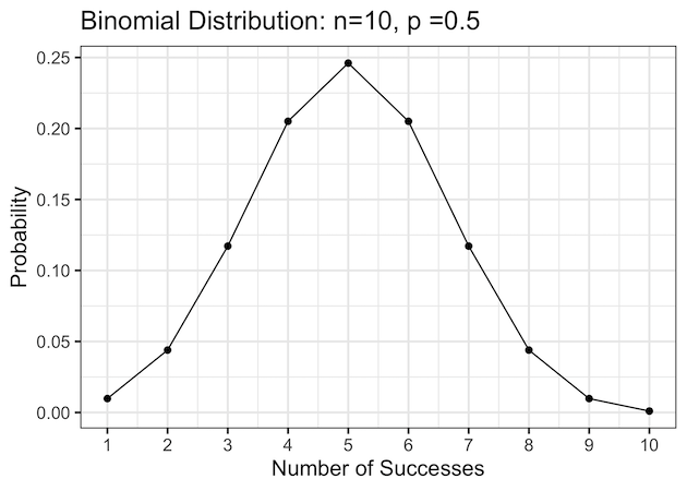
Visualizing Binomial Distribution as a line plot
One of the ways to visualize binomial distribution is to make a line plot of probability for successes. Let us compute the the probabilities using dbinom() function for all possible successes in tossing a fair coin 10 times.
# number of trials
n = 10
# probability of success in a trial
p = 0.5
binom_prob_df1 <- tibble(n_success = 1:n) %>%
  mutate(prob = dbinom(n_success, size=n, prob=p))
And this how our probabilities look like.
binom_prob_df1

## # A tibble: 10 × 2
##    n_success     prob
##        <int>    <dbl>
##  1         1 0.00977
##  2         2 0.0439
##  3         3 0.117
##  4         4 0.205
##  5         5 0.246
##  6         6 0.205
##  7         7 0.117
##  8         8 0.0439
##  9         9 0.00977
## 10        10 0.000977
Here we visualize these binomial probabilities as line plot using ggplot’s geom_line() function with number of successes on x-axis and the probability on y-axis.
binom_prob_df1 %>%
  ggplot(aes(x=n_success, y=prob))+
  geom_line()+
  geom_point(size=2)+
  scale_x_continuous(breaks=1:n)+
  scale_y_continuous(breaks = scales::pretty_breaks(n = 5))+
  labs(x= "Number of Successes",
       y= "Probability",
       title=paste0("Binomial Distribution: n=",n,", p =",p))
Quickly we can see that, when we toss a fair coin 10 times getting 5 successes is most likely with a probabiliy of about 0.25.
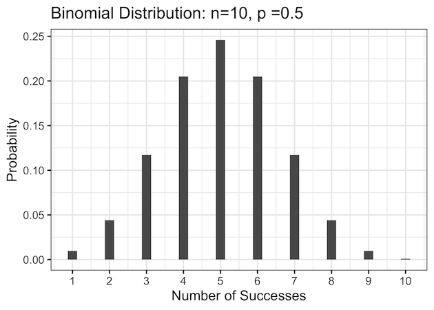
Visualizing Binomial Distribution as a bar plot
Another way to visualize the binomial distribution is to use barplot with number of successes on x-axis and probability on y-axis. Visualizing binomial distribution as a barplot is more common. And here we use geom_col() function to make the bar plot.
binom_prob_df1 %>%
  ggplot(aes(x=n_success,y=prob))+
  geom_col(width=0.25)+
  scale_x_continuous(breaks=1:n)+
  scale_y_continuous(
                     breaks = scales::pretty_breaks(n = 5))+
  labs(x= "Number of Successes",
       y= "Probability",
       title=paste0("Binomial Distribution: n=",n,", p =",p))
ggsave("binomial_probability_distribution_barplot_n10_p5.png")
When the coin is fair, i.e. the probability of success is 50%, we can see that the binomial distribution is symmetric.
Binomial Distribution: A biased coin example
Let us quickly consider a scenario, where our coin is not a fair coin, i.e with p =0.7 biased to have more heads than tails.
# probability of head/success
p <- 0.7
# binomial distribution with dbinom()
binom_prob_df3 <- tibble(n_success=1:n) %>%
  mutate(prob=dbinom(n_success,n,p))

# barplot visualize
binom_prob_df3 %>%
  ggplot(aes(x=n_success,y=prob))+
  geom_col(width=0.25)+
  scale_x_continuous(breaks=1:n)+
  scale_y_continuous(breaks = scales::pretty_breaks(n = 5))+
  labs(x= "Number of Successes",
       y= "Probability",
       title=paste0("Binomial Distribution: n=",n,", p =",p))
ggsave("binomial_probability_distribution_barplot_n10_p7p.png")
Since the coin is biased towards heads and when we consider getting heads as successes, Now the binomial distribution is skewed. And also getting 7 heads/successes is the most likely outcome compared to the other outcomes.


