• Skip to primary navigation
  • Skip to main content
  • Skip to primary sidebar

Data Viz with Python and R

Learn to Make Plots in Python and R

  • Home
  • Seaborn
  • Matplotlib
  • ggplot2
  • Altair
  • About
    • Privacy Policy
  • Visualizing Activation Functions in Neural Networks
  • Confusion Matrix Calculator
  • Visualizing Dropout Rate in Neural Network
  • Visualizing Loss Functions in Neural Networks
  • Show Search
Hide Search

wrap long axis tick labels ggplot2

How to wrap long axis tick labels into multiple lines in ggplot2

datavizpyr · January 29, 2022 ·

Wrapping or Folding long axis tick labels in a ggplot into multiple lines

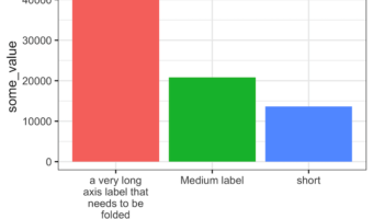
Dealing with long, overlapping axis labels that make your ggplot2 visualizations unreadable? This comprehensive guide shows you exactly how to wrap axis labels ggplot2 into multiple lines with ready-to-use code examples. Long axis labels are a common problem in data … [Read more...] about How to wrap long axis tick labels into multiple lines in ggplot2

Filed Under: barplot ggplot2, ggplot2, R Tagged With: wrap long axis tick labels ggplot2

Primary Sidebar

Python & R Viz Hubs

  • Seaborn Guide & Cookbook
  • ggplot2 Guide & Cookbook
  • Matplotlib Guide & Cookbook
  • Confusion Matrix Calculator
  • Visualizing Activation Functions
  • Visualizing Dropout
  • Visualizing Loss Functions

Buy Me a Coffee

Copyright © 2026 · Daily Dish Pro on Genesis Framework · WordPress · Log in

Go to mobile version