
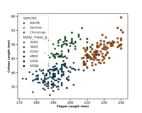
Seaborn’s scatterplot function allows us to make compelling scatter plots easily. In this post we will learn how to customize edge color of a scatter plot made with Seaborn. By default, Seaborn’s scatter plot function colors the markers edge color to be white. In this post, we will see how to change the default edge… Continue reading How To Change Edge Color on Seaborn Scatter Plot?
Tag: Seaborn
How To Make Lower Triangular Heatmap with Python?

Heatmaps are a great way to quickly visualize the actual data coded as colors. Heatmaps of correlation matrix is useful to understand the relationship between multiple features or variable. However, since the correlation matrix is symmetric, it is more useful to make heatmap of upper or lower triangular part of correlation matrix as having both… Continue reading How To Make Lower Triangular Heatmap with Python?
How to Make Scatterplot with Marginal Density Plots with Seaborn

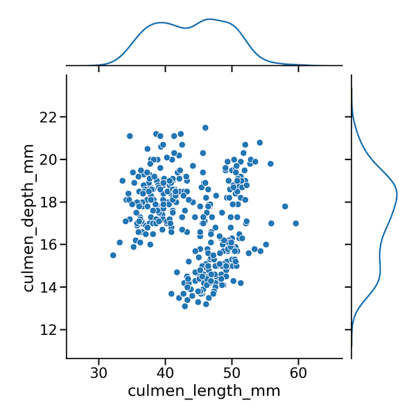
In this tutorial, we will use Seaborn and learn how to make a scatterplot between two quantitative variables with marginal density plots on the sides. We will use Seaborn’s JointGrid() to define the features of the plot and then add scatter plot on top first and then add marginal density plots as marginal. This strategy… Continue reading How to Make Scatterplot with Marginal Density Plots with Seaborn
How To Make Scatterplot with marginal boxplots with Seaborn ?
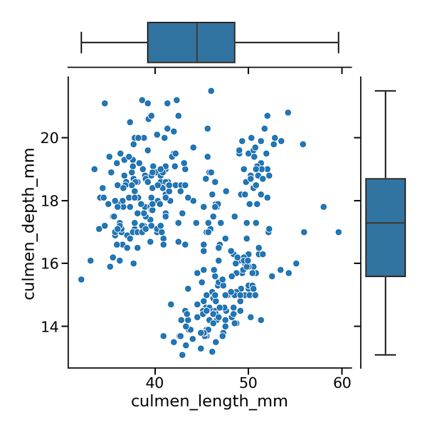
In this post, we will learn how to make a scatterplot with marginal boxplots using Seaborn in Python. To make a scatterplot we will use some of Seaborn’s powerful but not very well known functionalities. More specifically, we will use Seaborn’s JointGrid() to set up the plot features and then add two layers of plots.… Continue reading How To Make Scatterplot with marginal boxplots with Seaborn ?
How to Make Histograms with Density Plots with Seaborn histplot?

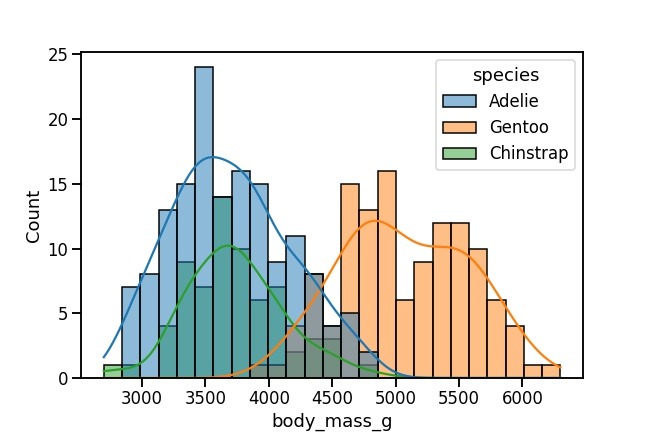
In this tutorial, we will see how to make a histogram with a density line using Seaborn in Python. With Seaborn version 0.11.0, we have a new function histplot() to make histograms. Here, we will learn how to use Seaborn’s histplot() to make a histogram with density line first and then see how how to… Continue reading How to Make Histograms with Density Plots with Seaborn histplot?