
ggplot2 adds colors to its plot automatically. Sometimes you might want to get the list of colors (color codes) that ggplot2 uses. In this post, we will learn how to get the color codes that ggplot2 uses by default in a plot. We will use scales package in tidyverse to get the … [Read more...] about How To Get the Default Color Codes of ggplot2?
R
How To Manually Specify Colors for Barplot in ggplot2?

One of the great things about making plots with ggplot2 is that it offers a number of ways to add colors to the plots. We can use ggplot2's default options for adding colors to plots. However, sometimes one might want to manually specify colors to a plot. There are a few ways to … [Read more...] about How To Manually Specify Colors for Barplot in ggplot2?
How To Make Scatterplot with Marginal Histograms in R?

In this post, we will learn how to make a scatterplot with marginal histograms in R. We will use ggExtra, one of the ggplot2 extension packages to make scatterplot with marginal histogram. First, we will add simple marginal histograms to a scatterplot made with ggplot2. Next, we … [Read more...] about How To Make Scatterplot with Marginal Histograms in R?
A mistake to Avoid while making boxplot with datapoints in ggplot2
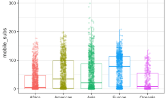
Making a boxplot with data points on top of the boxplot is a great way to show distributions of multiple groups. A big advantage is that one can see the raw data and the summary stats of distributions using boxplot with data points. ggplot2 in R makes it easy to make boxplots … [Read more...] about A mistake to Avoid while making boxplot with datapoints in ggplot2
How to Make Time-Series Plot with Rolling Mean in R?
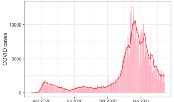
In this post we will learn how to make a time-series plot with a rolling mean using R. Often time-series data fluctuate a lot in short-term and such fluctuations can make it difficult to see the overall pattern in the plot. A solution is to smooth-out the short term … [Read more...] about How to Make Time-Series Plot with Rolling Mean in R?