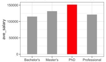
Sometimes while making a barplot, you might like to highlight a single bar in different color when compared to other bars. In this post, we will learn how to highlight a bar in barplot using ggplot2 in R. A Barplot displays counts or some quantitative variable corresponding to … [Read more...] about How To Highlight a Bar in Barplot in R?
R
How To Make Barplots with Error bars in ggplot2?
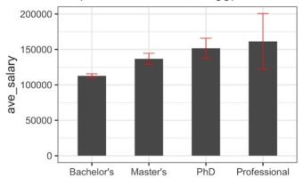
In this post, we will learn how to make a barplot with error bar using ggplot2 in R. Barplot alone is useful to display counts for multiple categories. However, often there may be uncertainty around the count values and we could represent as error bar on the barplot. Let us … [Read more...] about How To Make Barplots with Error bars in ggplot2?
Visualizing Intersection Sets with UpSet Plot: A Replacement for Venn Diagrams
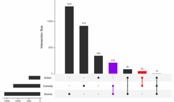
UpSet Plots in R with UpSetR: A Scalable Alternative to Venn Diagrams Venn diagrams work for up to three sets, but beyond that they become cluttered and hard to interpret. The UpSetR package solves this with UpSet plots, using a matrix layout plus bar charts to show … [Read more...] about Visualizing Intersection Sets with UpSet Plot: A Replacement for Venn Diagrams
How to Add Dollar Symbol for Axis Labels with ggplot2?

This is a quick guide on how to add dollar signs ($) to your axis labels in ggplot2. We will use the label_dollar() function from the versatile scales package to handle the formatting. This function automatically adds the dollar prefix and inserts commas as thousands … [Read more...] about How to Add Dollar Symbol for Axis Labels with ggplot2?
How To Make Title Bold in ggplot2?

Want to make your plot titles stand out and look more professional? This comprehensive guide shows you exactly how to make title bold ggplot2 using multiple styling methods, with ready-to-use code examples. 📚 Complete ggplot2 guide — 35+ tutorials with … [Read more...] about How To Make Title Bold in ggplot2?