
When you have multiple variables you might want to quickly look at how each variable is distributed and how each variable is related to other variables. Basically, we are interested in histograms of each variable and scatter plots for all pairs of variables. Seaborn's … [Read more...] about How to Make Pairplot with Seaborn in Python?
Python
How To Facet a Scatter Plot with Altair?
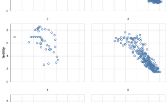
Faceting is a great technique to simplify a complex visualization. Faceting splits a single plot into multiple smaller plots containing subset of data corresponding to a group. This tutorial we will see an example of how to facet a scatter plot with Altair in Python. Let us … [Read more...] about How To Facet a Scatter Plot with Altair?
Coloring Boxplots with Seaborn Palettes

Boxplots made with Seaborn automatically gets colors by default. Sometimes you might want to change and assign different colors to the boxes in the boxplot. For example, one might want to color boxplots with colors that are colorblind friendly. One great solution to color the … [Read more...] about Coloring Boxplots with Seaborn Palettes
Simple Scatter Plot with Matplotlib in Python
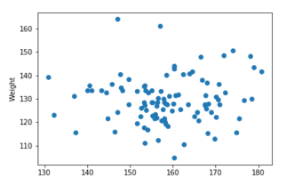
Matplotlib is one of the most popular plotting libraries in Python. As the name kind of hints, Matplotlib is bases on MATLAB style interface offers powerful functions to make versatile plots with Python. In this post, we will see examples of simple scatter plot with … [Read more...] about Simple Scatter Plot with Matplotlib in Python
Scatter Plot with Regression Line using Altair in Python
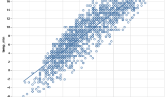
Adding regression line to scatter plot is a great way to understand the relationship between two numeric variables. In this post, we will see an example of using Altair to make a scatter plot with regression line using real world dataset. Let us load the packages we need. … [Read more...] about Scatter Plot with Regression Line using Altair in Python