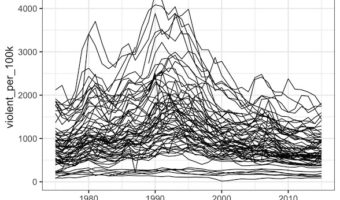
Line plots or time series plots are helpful to understand the trend over time. In this post we will learn how to make multiple line plots (or time-series plots in the sample plot) in R using ggplot2. Let us load tidyverse the suite of R packages including ggplot2 to make the … [Read more...] about Multiple Line Plots or Time Series Plots with ggplot2 in R
ggplot2
How To Make Ridgeline Plot with ggridges in R?
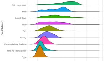
Ridgeline plot is one of the data visualization techniques that is suitable for visualizing multiple distributions or changes in distributions over time or space. Claus Wilke made created this plot and a package in R to make this easily. He defines it as a partially overlapping … [Read more...] about How To Make Ridgeline Plot with ggridges in R?
How To Make Violin Plots with ggplot2 in R?
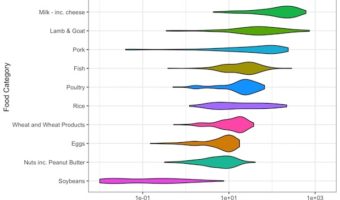
Violin plots are a way visualize numerical variables from one or more groups. Violin plots are similar to box plots. A boxplot shows a numerical distribution using five summary level statistics. Violin plots have the density information of the numerical variables in addition to … [Read more...] about How To Make Violin Plots with ggplot2 in R?
How To Highlight a Bar in Barplot in R?
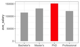
Sometimes while making a barplot, you might like to highlight a single bar in different color when compared to other bars. In this post, we will learn how to highlight a bar in barplot using ggplot2 in R. A Barplot displays counts or some quantitative variable corresponding to … [Read more...] about How To Highlight a Bar in Barplot in R?
How To Make Barplots with Error bars in ggplot2?
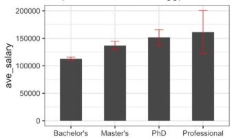
In this post, we will learn how to make a barplot with error bar using ggplot2 in R. Barplot alone is useful to display counts for multiple categories. However, often there may be uncertainty around the count values and we could represent as error bar on the barplot. Let us … [Read more...] about How To Make Barplots with Error bars in ggplot2?