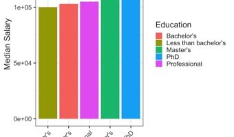
In this tutorial, we will see examples of making barplots and coloring the barplots in a few simple ways. We will see how to color barplots manually by specifying a color of interest and how to color a barplot by another variable in the dataset. Let us load tidyverse suite of … [Read more...] about Coloring Barplots with ggplot2 in R
ggplot2
How to Make Horizontal Stacked Barplots with ggplot2 in R?

Stacked barcharts are a variant of barplots, when you have data from multiple groups. In this tutorial, we will see two examples of making stacked barplots using ggplt2 in R. First we will see how to make stacked barplot of two groups with one on top of the other. In the second … [Read more...] about How to Make Horizontal Stacked Barplots with ggplot2 in R?
Heatmap from Matrix using ggplot2 in R

Heatmaps are data visualization tool that displays a matrix of data as a matrix of colors. For example, matrix elements with low values will have lighter colors and the elelments with high values will have a darker color. In earlier post we saw examples of making heatmap … [Read more...] about Heatmap from Matrix using ggplot2 in R
How To Make Simple Heatmaps with ggplot2 in R?

Heatmaps are a powerful way to visualize multi-dimensional data. By representing numerical values as colors within a matrix, heatmaps allow us to spot patterns, clusters, and outliers instantly. For example, you might visualize high values in a dark color and low values in a … [Read more...] about How To Make Simple Heatmaps with ggplot2 in R?
How To Make Boxplots with Data Points in R using ggplot2?
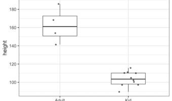
Boxplots with data points are a great way to visualize multiple distributions at the same time without losing any information about the data. In this tutorial, we will see examples of making Boxplots with data points using ggplot2 in R and customize the boxplots with data … [Read more...] about How To Make Boxplots with Data Points in R using ggplot2?