
In this post we will see how to make a stacked barplot showing percentage on its axis instead of count or proportion. We can make stacked barplot with count or proportion directly using geom_bar() function in ggplot2. Then we will use scales R package to add percentage on the axis instead of proportion.
Let us get started by loading packages needed for making the stacked barplot with percentage on it axis.
library(tidyverse)
library(palmerpenguins)
theme_set(theme_bw(16))
Stacked barplot with geom_bar() in ggplot2
We can make stacked plot by providing the second variable for fill as shown below. Note with geom_bar() function, we let ggplot2 to get the count for each species under the hood. In contrast, we have to provide the count for geom_col() function to make barplots.
penguins %>%
  ggplot(aes(x=species, fill=island))+
  geom_bar()
ggsave("stacked_bar_plot_with_geom_bar.png")

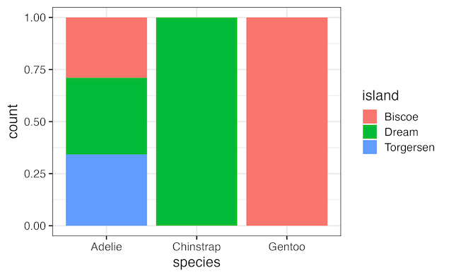
With position=”fill” argument to geom_bar() function we can convert the (stacked) barplot with count on y-axis to a barplot with proportion on y-axis.
penguins %>%
  ggplot(aes(x=species, fill=island))+
  geom_bar(position = "fill")
ggsave("stacked_bar_plot_with_proportion_using_geom_bar.png")
penguins %>%
  ggplot(aes(x=species, fill=island))+
  geom_bar(position = "fill")+
  scale_y_continuous(name = "percentage",
                     labels = scales::label_percent())
ggsave("stacked_bar_plot_with_percentage_using_geom_bar.png")

Explore the Complete ggplot2 Guide
35+ tutorials with code: scatterplots, boxplots, themes, annotations, facets, and more—tested and beginner-friendly.
Visit the ggplot2 Hub → No fluff—just code and visuals.


