• Skip to primary navigation
  • Skip to main content
  • Skip to primary sidebar

Data Viz with Python and R

Learn to Make Plots in Python and R

  • Home
  • Python Viz
  • Seaborn
  • Altair
  • R Viz
  • ggplot2
  • About
    • Privacy Policy
  • Show Search
Hide Search

Simple Scatter Plot with Altair in Python

datavizpyr · December 12, 2019 ·

In this post, we will see an example of making a simple scatter plot using Altair 4.0.0. Altair is one latest interactive data visualization library in Python. Altair is based vega and Vega-lite – A Grammar of Interactive Graphics.

import altair as alt
from vega_datasets import data

Let us load Seattle weather data from vega_datasets

seattle_weather = data.seattle_weather()
print(seattle_weather.head(n=3))


        date  precipitation  temp_max  temp_min  wind  weather
0 2012-01-01            0.0      12.8       5.0   4.7  drizzle
1 2012-01-02           10.9      10.6       2.8   4.5     rain
2 2012-01-03            0.8      11.7       7.2   2.3     rain

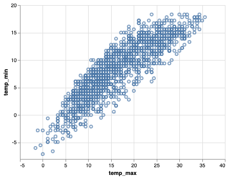
Let us make scatter plot with Altair. We first use Chart() function in Altair to provide the data and chain it with mark_point() function to make scatter plot. We then provide the aesthetics x and y axis to encode() function.

alt.Chart(seattle_weather).mark_point().encode(
    x='temp_max',
    y='temp_min'
)

As a result, we get a simple scatter plot between the two variables provided to the encode() function.

Simple Scatter Plot with Altair in Python
alt.Chart(seattle_weather).mark_point().encode(
    x='temp_max',
    y='temp_min'
)

We can save the Altair chart as html. Let us first store the Altair object in variable.

scatter_plot = alt.Chart(seattle_weather).mark_point().encode(
    x='temp_max',
    y='temp_min'
)

Altair’s save function can same the scatter plot as html file. The saved html file offers option to save as png file with other options.

scatter_plot.save('simple_scatter_plot_with_altairchart.html')

Related posts:

Area Chart with Altair in PythonArea Chart with Altair in Python Scatter plot with regression line using AltairScatter Plot with Regression Line using Altair in Python Highlight a bar in barplot in AltairHow To Highlight a Bar in Bar Chart in Altair? Stripplot Altair with jitterHow To Make Stripplot with Jitter in Altair Python?

Filed Under: Altair, Python, Scatter Plot, Scatter Plot with Altair Tagged With: Altair, Python

Primary Sidebar

Tags

Altair barplot Boxplot boxplot python boxplot with jiitered text labels Bubble Plot Color Palette Countplot Density Plot Facet Plot gganimate ggplot2 ggplot2 Boxplot ggplot2 error ggplot boxplot ggridges ggtext element_markdown() Grouped Barplot R heatmap heatmaps Histogram Histograms Horizontal boxplot Python lollipop plot Maps Matplotlib Pandas patchwork pheatmap Pyhon Python R RColorBrewer reorder boxplot ggplot Ridgeline plot Scatter Plot Scatter Plot Altair Seaborn Seaborn Boxplot Stock Price Over Time Stripplot UpSetR Violinplot Violin Plot World Map ggplot2

Buy Me a Coffee

Copyright © 2025 · Daily Dish Pro on Genesis Framework · WordPress · Log in

Go to mobile version