• Skip to primary navigation
  • Skip to main content
  • Skip to primary sidebar

Data Viz with Python and R

Learn to Make Plots in Python and R

  • Home
  • Python Viz
  • Seaborn
  • Altair
  • R Viz
  • ggplot2
  • About
    • Privacy Policy
  • Show Search
Hide Search

Scatter Plot with Transparent Points Using ggplot2 in R

datavizpyr · December 11, 2019 ·

Scatter plot is a great way visualize the relationship between two quantitative variables. However, scatter plot can suffer from over-plotting of data points, when you have lots of data. Overplotting plots multiple overlapping data points. One of the solutions to avoid overplotting is to set the transparency levels for data points using the argument alpha in ggplot2. Let us load ggplot2 to make the scatter plot with transparent data points.
library(ggplot2)
Let us make a data frame with two quantitative variables. We generate these variables using random numbers from normal/gaussian distribution.
set.seed(42)
x <- rnorm(2000, mean=15, sd=20)
y <- x+ rnorm(2000, mean=2, sd=30)
df <- data.frame(x=x, y=y)
Let us make a simple scatter plot to illustrate the problem of overplotting
df %>% 
  ggplot(aes(x=x, y=y)) + geom_point()
Scatter plot with overplotting of data points
We can see that many points overlap on each other and make it difficult to see most of the data points. Let us set transparency level to avoid over plotting
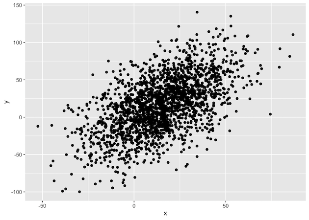
df %>%  
 ggplot(aes(x=x,y=y)) + geom_point(alpha=0.3)
Scatter plot with transparency of data points with alpha

Related posts:

Simple Scatter Plot in R with ggplot2 Customizing Labels on Bars in Side by side Stacked BarplotHow To Add Labels to Grouped Barplot with Bars Side-By-Side in R? Visualizing Missing Data with Barplot in R ggplot2Visualizing Missing Data with Barplot in R Annotate Clusters with Ellipse with Labels ggforceHow To Annotate Clusters with Circle/Ellipse by a Variable in R

Filed Under: ggplot2, R, Scatter Plot ggplot2 Tagged With: ggplot2, R

Primary Sidebar

Tags

Altair barplot Boxplot boxplot python boxplot with jiitered text labels Bubble Plot Color Palette Countplot Density Plot Facet Plot gganimate ggplot2 ggplot2 Boxplot ggplot2 error ggplot boxplot ggridges ggtext element_markdown() Grouped Barplot R heatmap heatmaps Histogram Histograms Horizontal boxplot Python lollipop plot Maps Matplotlib Pandas patchwork pheatmap Pyhon Python R RColorBrewer reorder boxplot ggplot Ridgeline plot Scatter Plot Scatter Plot Altair Seaborn Seaborn Boxplot Stock Price Over Time Stripplot UpSetR Violinplot Violin Plot World Map ggplot2

Buy Me a Coffee

Copyright © 2025 · Daily Dish Pro on Genesis Framework · WordPress · Log in

Go to mobile version