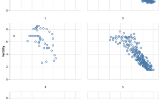
Faceting is a great technique to simplify a complex visualization. Faceting splits a single plot into multiple smaller plots containing subset of data corresponding to a group. This tutorial we will see an example of how to facet a scatter plot with Altair in Python. Let us … [Read more...] about How To Facet a Scatter Plot with Altair?
How to Reorder bars in barplot with ggplot2 in R

In this post, we will learn how to order bars in a barplot using ggplot2 in R. When we make barplot with ggplot2 on a character variable it places the group in alphabetical order. Here we will learn to use two functions, reorder() from base R and fct_reorder() function from … [Read more...] about How to Reorder bars in barplot with ggplot2 in R
How To Make Barplots with ggplot2 in R?
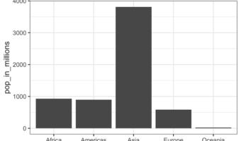
Barplots are a popular graphics that is widely used to show categorical data with retangular bars whose height represent the quantitative value the variable. In this post we will see multiple examples of making bar plots using ggplot2 in R. Let us first load tidyverse, a … [Read more...] about How To Make Barplots with ggplot2 in R?
How to Make Boxplots with ggplot2 in R?
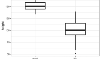
A boxplot is one of the simplest ways to summarize and visualize a distribution. Boxplots have been around for close to 50 years. The earliest form of Boxplot was invented by Mary Eleanor Spear as range plot and then John Tukey created box-and-whisker plot that uses quartiles of … [Read more...] about How to Make Boxplots with ggplot2 in R?
Coloring Boxplots with Seaborn Palettes

Boxplots made with Seaborn automatically gets colors by default. Sometimes you might want to change and assign different colors to the boxes in the boxplot. For example, one might want to color boxplots with colors that are colorblind friendly. One great solution to color the … [Read more...] about Coloring Boxplots with Seaborn Palettes