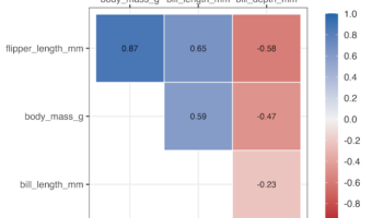
In this post, we will learn how to make a simle correlation heatmap of numerical variables in a dataframe using Corrr R package. The R package Corrr starting from version 0.4.4 has a autoplot() function enables you to make simple correllation heatmap in addition to correlation … [Read more...] about Correlation Heatmap wiht Corrr
How to wrap really long facet label in R
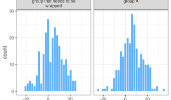
In this tutorial, we will learn how to wrap a really long labels in a facet plot made with ggplot2 using facet_wrap(). When the facet labels are too long, the label text gets cuts off. Here we will learn how can we fold or wrap the long facet labels into multiple lines so that … [Read more...] about How to wrap really long facet label in R
How to make stacked barplot with percent on x/y axis
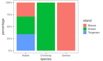
In this post we will see how to make a stacked barplot showing percentage on its axis instead of count or proportion. We can make stacked barplot with count or proportion directly using geom_bar() function in ggplot2. Then we will use scales R package to add percentage on the … [Read more...] about How to make stacked barplot with percent on x/y axis
Visualizing Correlation with tidymodels’ corrr package
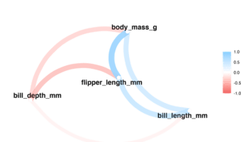
In this tutorial, we will learn examples of computing correlations among all the numerical variables in a dataframe and visualize the correlation in multiple ways. We will use Corrr package from tidymodels to compute the correlation and visualize the correlation. corrr is … [Read more...] about Visualizing Correlation with tidymodels’ corrr package
ggplot2 error: how to fix error in dataframe
In this post we will learn under what circumstances we will see a ggplot2 error that says something like "replacement has 9 rows, data has 8" in addition to other text that is not easily understood. We will also see an easy fix to such a difficult sounding error. Let us … [Read more...] about ggplot2 error: how to fix error in dataframe