
Creating a mean and SD plot with Seaborn Objects is essential for visualizing statistical summaries and data distribution across different groups in your dataset. The new Seaborn Objects interface (available from Seaborn 0.12.0+) follows grammar of graphics principles, allowing you to build sophisticated mean and standard deviation plots layer by layer.
👉 Want more? Explore the full Seaborn Tutorial Hub with 35+ examples, code recipes, and best practices.
In this comprehensive tutorial, you’ll learn how to make a mean and SD plot with Seaborn Objects using the modern object-oriented approach. We’ll demonstrate how to combine error bars, mean indicators, and custom styling to create publication-ready statistical visualizations in Python.
What You’ll Learn
- How to create mean and SD plot with Seaborn Objects using
so.Range()andso.Dot() - Building layered statistical plots with the grammar of graphics approach
- Using
so.Est(errorbar="sd")for standard deviation error bars - Implementing
so.Agg()for mean value calculations and visualization - Customizing colors, orientations, and styling for professional plots
We will use gapminder dataset to make the mean and SD values plot using Seaborn objects. The seaborn.objects is a new way to make plots using Seaborn that follows grammar of graphics rules and available from Seaborn version 0.12.0. With Seaborn objects, we can build a plot layer by layer.
Let us get started by loading the libraries needed to make mean SD plot with Seaborn.
import matplotlib.pyplot as plt
import pandas as pd
import numpy as np
import seaborn as sns
import seaborn.objects as so
sns.__version__

0.12.2
We use the gapminder data directly from datavizpyr’s github page.
p2data = "https://raw.githubusercontent.com/datavizpyr/data/master/gapminder-FiveYearData.csv"
gapminder = pd.read_csv(p2data)
gapminder.head()


country	year	pop	continent	lifeExp	gdpPercap
0	Afghanistan	1952	8425333.0	Asia	28.801	779.445314
1	Afghanistan	1957	9240934.0	Asia	30.332	820.853030
2	Afghanistan	1962	10267083.0	Asia	31.997	853.100710
3	Afghanistan	1967	11537966.0	Asia	34.020	836.197138
4	Afghanistan	1972	13079460.0	Asia	36.088	739.981106
Plotting SD errorbors with Seaborn objects
Here is the basic syntax of a plot made with a single layer.

In the example below we make a plot showing a range for each continent’s standard deviation for lifeExp. We use Seaborn objects’s Range() function and Est() function to show the range.

(
    so.Plot(gapminder, x='lifeExp', y="continent")
    .add(so.Range(),so.Est(errorbar="sd"))
)
With Seaborn objects, we can save a plot by using save() function as additional layer.
(
    so.Plot(gapminder, x='lifeExp', y="continent")
    .add(so.Range(),so.Est(errorbar="sd"))
    .save("sd_plot_seaborn_objects.png",
           format='png',
           dpi=150)
)
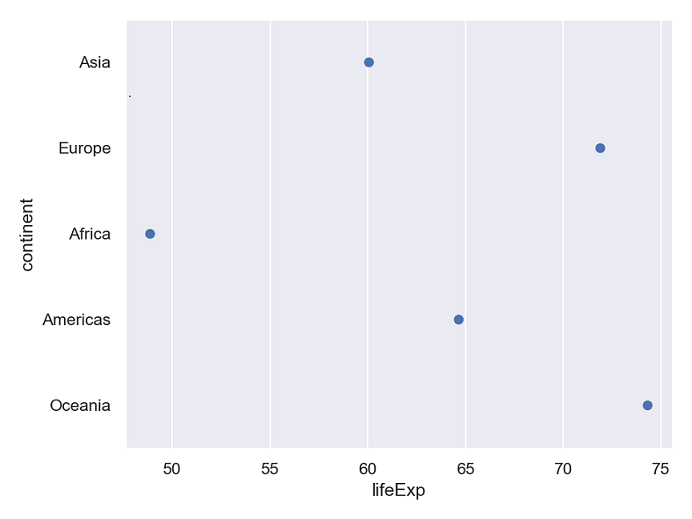
Plotting Mean values with Seaborn objects
we can plot the mean values per group on y-axis using Dot() and Agg() functions in Seaborn objects.
(
    so.Plot(gapminder, x='lifeExp', y="continent")
    .add(so.Dot(),so.Agg())
    .save("mean_plot_seaborn_objects.png",
           format='png',
           dpi=150)

)

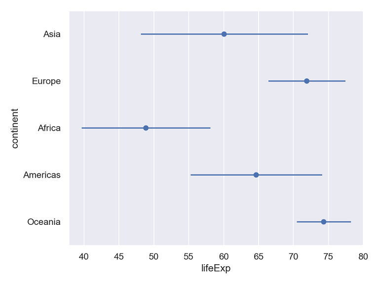
Building the mean and SD plot layer by layer
Now that we have shown independently how to plot mean and the SD range, we can add as layers to the same plot with Seaborn Objects.
(
    so.Plot(gapminder, x='lifeExp', y="continent")
    .add(so.Dot(),so.Agg())
    .add(so.Range(),so.Est(errorbar="sd"))
    .save("mean_sd_plot_seaborn_objects.png",
           format='png',
           dpi=150)

)

Adding color by variable to mean and SD error plot
We can also customize the mean and SD plot by adding colors based on the values of a variable in the data. In the example below we color by continet.
(
    so.Plot(gapminder, x='lifeExp', y="continent", color='continent')
    .add(so.Dot(),so.Agg())
    .add(so.Range(),so.Est(errorbar="sd"))
    .save("mean_sd_plot_colored_seaborn_objects.png",
           format='png',
           dpi=150)

)

Vertical Mean and SD plot
In the above examples, we made horizontal mean and SD plot, to make it a vertical plot, we switch the and x and y axis variables as shown below.
(
    so.Plot(gapminder, y='lifeExp', x="continent", color='continent')
    .add(so.Dot(),so.Agg())
    .add(so.Range(),so.Est(errorbar="sd"))
    .save("mean_sd_plot_colored_vertical_seaborn_objects.png",
           format='png',
           dpi=150)

)


