Facet plots, where one subsets the data based on a categorical variable and makes a series of similar plots with same scale is a great way to visualize when you have a numerical variable and a corresponding categorical variable. It is also known as small multiples as we make a matrix-panel plots of same type.
We can make facet plots in Python in multiple ways. In this post, we will see an example of making simple facet plots, panel of boxplots, using Seaborn’s Catplot function.
Let us first load the packages we need.
# load pandas
import pandas as pd
import seaborn as sns
import matplotlib.pyplot as plt
We will use 2019 Stack Overflow survey data to make the simple facet plot with Seaborn’s Catplot. We directly load the processed data from datavizpyr.com‘s github page.
data_url ="https://raw.githubusercontent.com/datavizpyr/data/master/SO_data_2019/StackOverflow_survey_filtered_subsampled_2019.csv"
data = pd.read_csv(data_url)
print(data.head(3))
   CompTotal Gender Manager YearsCode Age1stCode YearsCodePro   Education
0   180000.0    Man      IC        25         17           20    Master's
1    55000.0    Man      IC         5         18            3  Bachelor's
2    77000.0    Man      IC         6         19            2  Bachelor's
Let us subset the Stack Overflow survey data to have just three columns. We also filter out any rows with missing values and filter the rows with professional educational qualification for the sake of simplicity.
# select three columns
df = data[["CompTotal","Gender","Education"]]
# drop rows with missing values
df=df.dropna()
# filter out "Professional" educational qualification
df=df.query('Education!="Professional"')
Simple Boxplot with Seaborn Catplot
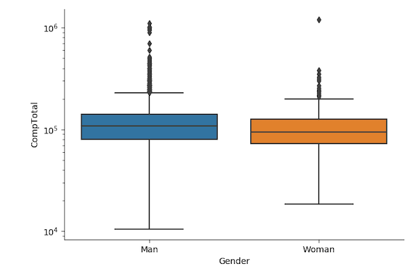
To start with, we can ignore educational qualification and make a simple box plot to see the effect of gender on developer salary using Seaborn’s Catplot with kind=”box” option.
g = sns.catplot(x="Gender",
                y="CompTotal",
                kind="box",
                data=df);
g.set(yscale="log");
Here we have applied log scale to the salary axis as it varies a lot.
Simple Faceted Boxplot with Seaborn Catplot
Sometimes you might want to see how the salary depends on gender. One way to visualize that is to use operlapping or multiple density plot or grouped boxplots.
A better way to make visualization where you have multiple categorical values and associated numerical variables is to use facet plot.
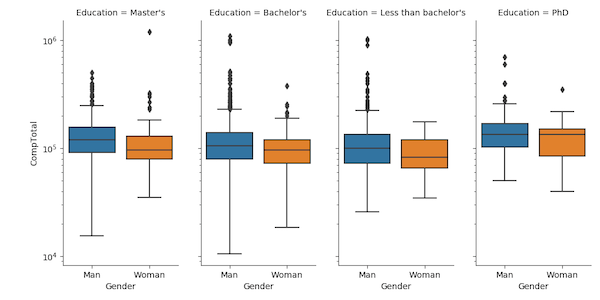
A simple or naive way to make facet plot is to use Seaborn’s Catplot with “col” or “row” arguments. We go ahead and make boxplot as before, but this time we specify which variable we want to facet on, i.e. to create small multiples as matrix panel.
In this example, we make a facet plot for each educational category and make a boxplot of salary distribution for men and women.
g = sns.catplot(x="Gender",
                y="CompTotal",
                col="Education",
                aspect=0.5,
                dodge=False,
                kind="box",
                data=df);
g.set(yscale="log");
We can adjust the size of small plot in facet plot using aspect argument. And we use dodge=False, to light the box in boxplot to align with x-axis text. We have also made the y-axis to be in log-scale as the salary varies a lot. And we get a decent facet plot using Seaborn’s Catplot.
A much better way to make facet plot in Seaborn is to use FacetGrid in Seaborn. And that topic is for another blog post.