In this tutorial, we will learn how to color data points in a scatter plot by a variable using Altair in Python.
Let us load Altair and Pandas.
import altair as alt
import pandas as pd
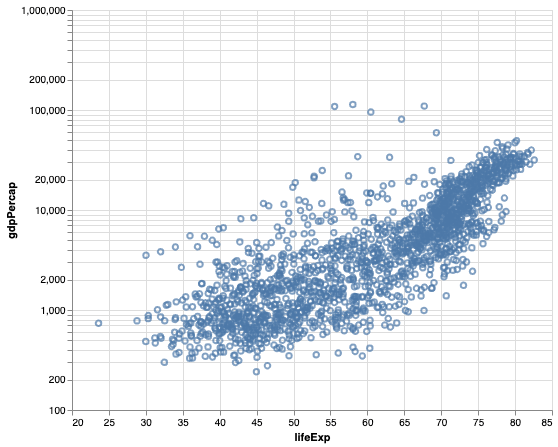
We will use gapminder data to make scatter plot first and color by a variable using Altair.
data_url = 'http://bit.ly/2cLzoxH'
gapminder = pd.read_csv(data_url)
gapminder.head()
	country	year	pop	continent	lifeExp	gdpPercap
0	Afghanistan	1952	8425333.0	Asia	28.801	779.445314
1	Afghanistan	1957	9240934.0	Asia	30.332	820.853030
2	Afghanistan	1962	10267083.0	Asia	31.997	853.100710
3	Afghanistan	1967	11537966.0	Asia	34.020	836.197138
4	Afghanistan	1972	13079460.0	Asia	36.088	739.981106
To make a simple scatter plot with Altair we use mark_point() object on the chart object with gapminder data. In addition to specifying x and y axis we specify range of x and y-axis with domain argument inside alt.X() function. We also change the y-axis scale to log-scale since gdpPercap value vary a lot.
alt.Chart(gapminder).mark_point().encode(
    alt.X('lifeExp', scale=alt.Scale(domain=(20, 85))),
    alt.Y('gdpPercap', scale=alt.Scale(type='log', base=10,domain=(100, 150000))),
).properties(height=400,width=480)
By plotting the y-axis on log scale, we can easily see the . linear trend between lifeExp and gdpPercap in the scatter plot made with Altair below.
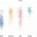
How to Add Color Scatter plot by a variable in Altair?
Let us color our data points on the scatter plot based on a variabile in the data frame. To color scatter plot by variable in Altair, we just need to use color argument inside the encode() function and specify the name of the variable we want to use to color.
In this example, we color data points in the scatter plot by the variable “continent”
alt.Chart(gapminder).mark_point().encode(
    alt.X('lifeExp', scale=alt.Scale(domain=(20, 85))),
    alt.Y('gdpPercap', scale=alt.Scale(type='log', base=10,domain=(100, 150000))),
    color="continent"
).properties(height=400,width=480)
Altair has nicely colored data points by the variable we specified.