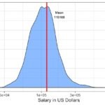
Adding vertical line or lines at mean or median of density plot can help us understand the trend in the data. When you make multiple density plots adding vertical mean/median line for each group in the same color as the density plot is of great help.
In this post, we will see an example of adding multiple vertical lines at median in a multiple density plot such that each median line is of the same color as the group it represents.
Let us first load the data. To make multiple density plot in R with ggplot2 we use results from 2019 StackOverflow developer survey data. The results from the 2019 survey is processed already and is available at datavizpyr.com‘s github page.
# github link to data
stackoverflow_file <- "https://raw.githubusercontent.com/datavizpyr/data/master/SO_data_2019/StackOverflow_survey_filtered_subsampled_2019.csv"
# read the data directly from github
survey_results <- read_csv(stackoverflow_file)
We will be making multiple density plot using Salary and Manager data from the survey. The CompTotal column gives us the salary/compensation and the Manager column gives us the information whether the developer is an Individual contributor or a manger.
survey_results %>% select(CompTotal,Manager)
## # A tibble: 5,000 x 2
##    CompTotal Manager
##        <dbl> <chr>
##  1    180000 IC
##  2     55000 IC
##  3     77000 IC
##  4     67017 IC
##  5     90000 IC
Let us first make a multiple density plot with survey data to see the difference is salary distribution between IC and manager. We will use geom_density() function to make the density plot. In order to make multiple density plot, one for each group, we use fill and color within global aesthetics. We have also used log scale for x-axis.
survey_results%>%
  ggplot(aes(x=CompTotal, color=Manager, fill=Manager)) +
  geom_density(alpha=0.3,size=1)+
  scale_x_log10()+
  labs(x= "Salary",
       subtitle="Salary Distribution in US")+
  theme(legend.position="bottom")
We get a nice multiple density plot with each group colored and filled by the manager variable. In this example, our density plot has just two groups. ggplot2 can make the multiple density plot with arbitrary number of groups.

Let us add vertical lines to each group in the multiple density plot such that the vertical mean/median line is colored by variable, in this case “Manager”.
To add vertical lines at median or mean, we need to compute the median/mean values. In this post, we compute median values for each group and plot the vertical lines at median.
We use group_by() followed by summarize() functions to compute median salary for each group and store the result as a dataframe.
med_salary_df <- survey_results %>%
  group_by(Manager) %>%
  summarize(median=median(CompTotal))
And the median salary dataframe looks like this.
med_salary_df

## # A tibble: 2 x 2
##   Manager median
##  <chr>    <dbl>
## 1 IC      102000
## 2 Manager 140000
Now we are ready to add vertical lines at median to the multiple density plots in R. We will first make multiple density plot as in the previous example, i.e. specify aes(), geom_density() and scale x x-axis. And then we will add a later of vertical line using geom_vline() function.
geom_vline() function helps us to add vertical line at desired place on the density plot. In our example, we want geom_vline() to use the data frame with median salary information per group. So we provide the datframe to data argument and specify the xintercept variable and the variable to color the vertical lines within aes() function.
survey_results%>%
  ggplot(aes(x=CompTotal, color=Manager, fill=Manager)) +
  geom_density(alpha=0.3,size=1)+
  scale_x_log10()+
  geom_vline(data = med_salary_df, aes(xintercept = median,
                                       color = Manager), size=1.5)+
  labs(x= "Salary",
       subtitle="Salary Distribution in US")+
  theme(legend.position="bottom")
And we get a nice multiple density plot with vertical median line per group and colored by the group variable.


