In this post, we will see how can we add text annotation to heatmaps made with ggplot2. In ggplot2, we can make simple heatmaps using ggplot2’s geom_raster() and geom_tile(). In this post, we will use geom_text() to add text annotation, i.e. numerical values in the heatmap. We will also see multiple examples of adding color annotation based the numerical values visualized in the heatmap.
library(tidyverse)
library(tidyquant)
theme_set(theme_bw(16))
library(glue)
Let us make a heatmap of monthly returns of Nvidia stock since 1999.
start_date <- as.Date("1980-01-01")
end_date <- Sys.Date()
company_name <- "Nvidia"
stock_ticker <- "NVDA"
print(stock_ticker)
## [1] "NVDA"
We use tidyquant package to get the stock data
stock_df <- tq_get(stock_ticker,
                   from = start_date,
                   to = end_date)

stock_df |> head()

## # A tibble: 6 × 8
##   symbol date         open   high    low  close     volume adjusted
##   <chr>  <date>      <dbl>  <dbl>  <dbl>  <dbl>      <dbl>    <dbl>
## 1 NVDA   1999-01-22 0.0437 0.0488 0.0388 0.0410 2714688000   0.0376
## 2 NVDA   1999-01-25 0.0443 0.0458 0.0410 0.0453  510480000   0.0416
## 3 NVDA   1999-01-26 0.0458 0.0467 0.0411 0.0418  343200000   0.0383
## 4 NVDA   1999-01-27 0.0419 0.0430 0.0396 0.0417  244368000   0.0382
## 5 NVDA   1999-01-28 0.0417 0.0419 0.0413 0.0415  227520000   0.0381
## 6 NVDA   1999-01-29 0.0415 0.0417 0.0396 0.0396  244032000   0.0363
And compute monthly returns of the stock since 1999
monthly_return <- stock_df %>%
    tq_transmute( select     = adjusted,
               mutate_fun = periodReturn,
               period     = "monthly") %>%
    mutate(return= ifelse(monthly.returns > 0, "+ve", "-ve")) %>%
    mutate(year=factor(year(date)) ) %>%
    mutate(month=month(date, label=TRUE))
We have the data ready for making a heatmap.
monthly_return |>
  head()
## # A tibble: 6 × 5
##   date       monthly.returns return year  month
##   <date>               <dbl> <chr>  <fct> <ord>
## 1 1999-01-29         -0.0349 -ve    1999  Jan
## 2 1999-02-26          0.155  +ve    1999  Feb
## 3 1999-03-31         -0.0370 -ve    1999  Mar
## 4 1999-04-30         -0.136  -ve    1999  Apr
## 5 1999-05-28         -0.0651 -ve    1999  May
## 6 1999-06-30          0.121  +ve    1999  Jun
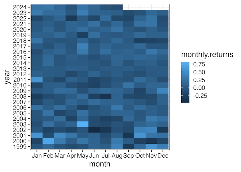
Heatmap with ggplot2’s geom_raster()
We can make a heat map with ggplot2’s geom_raster() function. Here is a heatmap of monthly returns of Nvidia over the years using geom_raster()
monthly_return |>
  ggplot(aes(x=month, y=year, fill=monthly.returns))+
  geom_raster()
ggsave("heatmap_with_geom_raster_ggplot2.png")

Heatmap with ggplot2’s
We can also use geom_tile() fin gggplot2 and make a heatmap. Here is the same heatmap of monthly returns of Nvidia over the years but using geom_tile()
monthly_return |>
  ggplot(aes(x=month, y=year, fill=monthly.returns))+
  geom_tile()
ggsave("heatmap_with_geom_tile_ggplot2.png")
monthly_return |>
  ggplot(aes(x=month, y=year, fill=return))+
  geom_raster()+
  geom_text(aes(label = paste0(round(monthly.returns*100,1), "%")))+
  scale_fill_brewer(palette = "Dark2")
ggsave("heatmap_with_text_color_annotation_ggplot2.png")

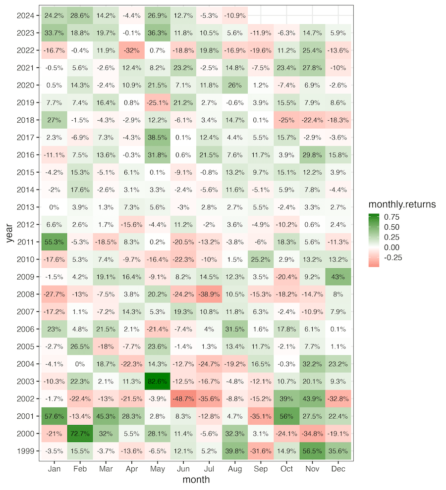
monthly_return |>
  ggplot(aes(x=month, y=year, fill=monthly.returns))+
  geom_raster()+
  geom_text(aes(label = paste0(round(monthly.returns*100,1), "%")))+
  scale_fill_gradient2(midpoint = 0, mid="white", low="#dc322f", high="#008000")
ggsave("text_annotation_to_heatmap_ggplot2.png", width=10, height=11)
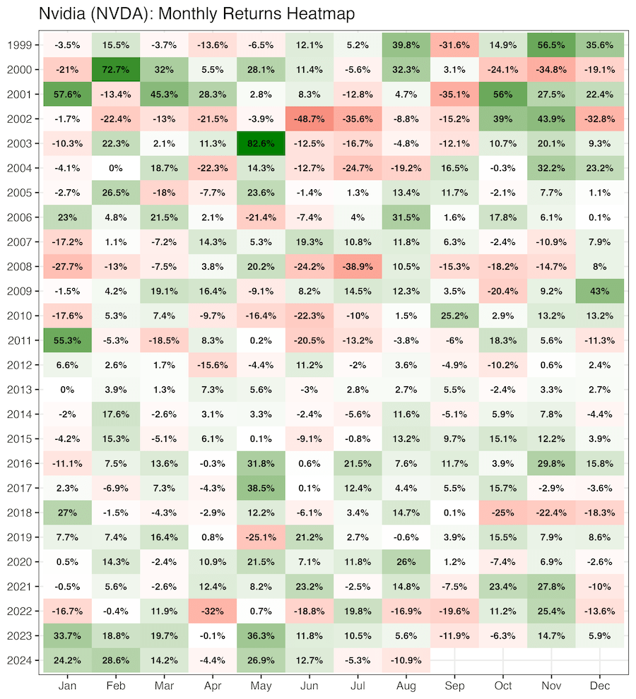
monthly_return |>
  ggplot(aes(x=month, y=fct_rev(year), fill=monthly.returns))+
  geom_raster()+
  geom_text(aes(label = paste0(round(monthly.returns*100,1), "%")),fontface = "bold")+
  scale_fill_gradient2(midpoint = 0, mid="white", low="#dc322f", high="#008000")+
  labs(title=glue("{company_name} ({stock_ticker}): Monthly Returns Heatmap"),
       x=NULL, y=NULL)+
  theme(legend.position = "none")
ggsave("customizing_text_annotation_to_heatmap_ggplot2.png", width=10, height=11)