Horizontal boxplots are useful when you are making a boxplot multiple groups & you want the group names to be easily readable. And horizontal boxplots can also make it easy see the pattern among the groups quickly.
In this post will learn how to make horizontal boxplots with ggplot2 in R. And then we will learn to customize the horizontal boxplot plot with log scale and order boxes in horizontal boxplot using reorder() function in R.
Loading Package and Data
Let us load tidyverse from RStudio and also change the default ggplot theme to theme_bw() for the boxplots we make.
library(tidyverse)
theme_set(theme_bw(base_size=16))
We will use the processed salary/education data from 2019 Stack Overflow survey results. The survey data is processed and accessible from datavizpyr.com‘s github page.
salary_data_file <- "https://raw.githubusercontent.com/datavizpyr/data/master/SO_data_2019/2019_Stack_Overflow_Survey_Education_Salary_US.tsv"
salary_data <- read_tsv(salary_data_file)
The salary dataframe contains just two columns; education and salary in US for about 5000 developers.
salary_data %>% head()

## # A tibble: 6 x 2
##   CompTotal Education
##       <dbl> <chr>
## 1    180000 Master's
## 2     55000 Bachelor's
## 3     77000 Bachelor's
## 4     67017 Bachelor's
## 5     90000 Less than bachelor's
## 6     58000 Bachelor's
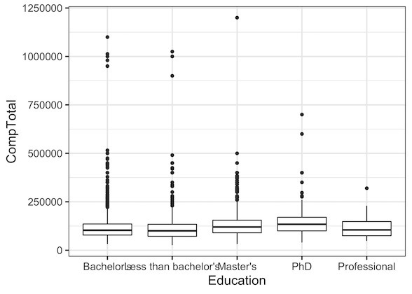
Boxplot plot with overlapping axis labels
Let us make simple boxplot with Education on x-axis and Salary on Y-axis using ggplot2 in R. We use geom_boxplot() function to make the boxplot.
salary_data %>%
  ggplot(aes(x=Education, y=CompTotal)) +
  geom_boxplot()
How to Make Horizontal Boxplot in R
It is easy to see that, we can make a number of improvements to make the boxplot better. First thing to notice is that x-axis labels overlap with each other and it makes it difficult to read. Horizontal boxplot is a perfect solution to this issue. By making the boxplot horizontal, we will swap x-axis with y-axis and the labels will be easier to read.
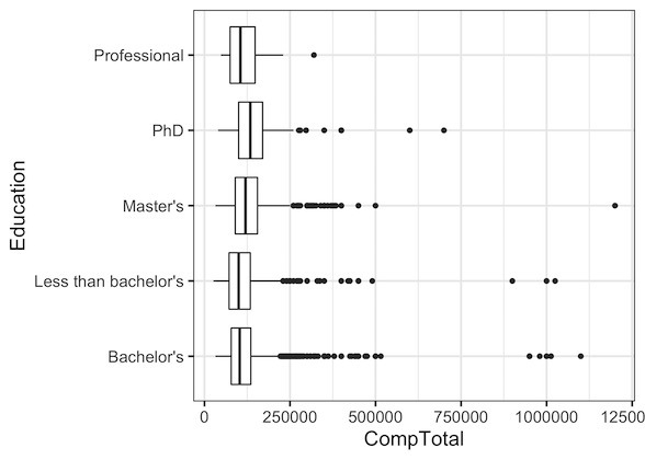
Let us change the above boxplot to be a horizontal boxplot. By adding coord_flip() function to the ggplot2 object, we can swap the x and y-axis.
In this example, we simply add coord_flip() to our simple boxplot object
# make horizontal boxplot by
# flipping the coordinates
salary_data %>%
  ggplot(aes(x=Education, y=CompTotal)) +
  geom_boxplot()+
  coord_flip()
Now we can easily read the labels (now on y-axis of the boxplot) on the horizontal boxplot.
Add log scale to horizontal boxplot in R
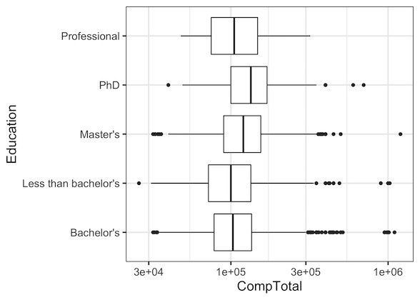
We can customize the horizontal boxplot further as we can see the horizontal boxplot is dominated by the outlier salaries. A solution is to scale salary values the x-axis to log-scale using scale_y_log10() in ggplot2.
salary_data %>%
  ggplot(aes(x=Education, y=CompTotal)) +
  geom_boxplot()+
  coord_flip()+
  scale_y_log10()
Note that in our original boxplot salary was on y-axis and that is why we use scale_y_log10(). Now our horizontal boxplot looks better with log scale for salary. We can easily see that median salary is around 100K US dollars for most of the groups.
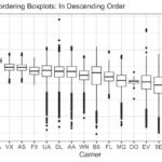
How to Reorder Horizontal Boxplot in R
We can further customize the horizontal boxplot by re-ordering the boxes by median salary value of the education groups. We can use reorder() function in base R to re-order the boxplot.
salary_data %>%
  ggplot(aes(x=reorder(Education, CompTotal), y=CompTotal)) +
  geom_boxplot()+
  coord_flip()+
  scale_y_log10()+
  labs(x="Education", y="Salary in US Dollars")
Reordering the boxes in boxplot by median salary clearly reveals the pattern that on an average developers with PhD degrees make more money, followed by developers with Masters and so on.

Note: starting with ggplot2 3.3, we can make horizontal boxplots without using coord_flip(). Check out the tutorial below.