ggplot2 themes offer a great ways to change the look of a plot easily. ggplot2’s theme() function lets you control all aspects of the themes in general. However, ggplot2 has multiple built in themes that are ready to use. In tutorial, we will see examples of 6 ggplot2 themes that are available as part of ggplot2.
We will first load tidyverse, the suite of R packages.
library(tidyverse)
We will use the Palmer penguins data to illustrate the 6 themes from ggplot2. Let us load the data directly from github page.
path2data <- "https://raw.githubusercontent.com/cmdlinetips/data/master/palmer_penguins.csv"
penguins<- readr::read_csv(path2data)
## Parsed with column specification:
## cols(
##   species = col_character(),
##   island = col_character(),
##   bill_length_mm = col_double(),
##   bill_depth_mm = col_double(),
##   flipper_length_mm = col_double(),
##   body_mass_g = col_double(),
##   sex = col_character()
## )
Let us make a simple barplot using ggplot2 with Penguin data showing the number of penguins per each species. We will first make a simple barplot and save the plot as ggplot2 object.
p <- penguins %>%
  count(species) %>%
  ggplot(aes(x=species,y=n))+
  geom_col(width=0.5) +
  labs(x="Penguin Species", y="Count")
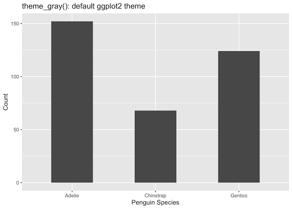
1. theme_gray(): default ggplot2 theme
If you don’t specify any theme, you will get ggplot2 made with theme_grey() or theme_gray(). Here the background color will be grey and may not be efficient if you are actually printing the plot.
p +
  labs(title="theme_gray(): default ggplot2 theme")
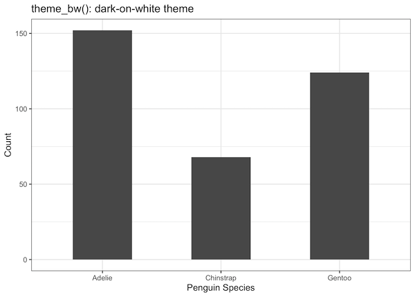
2. theme_bw(): Dark on white ggplot2 theme
ggplot2’s theme_bw() makes the plot on white background. Here is an example of theme_bw(). Here we simply add the theme layer to existing to the ggplot2 object we created first.
p +
  theme_bw()+
  labs(title="theme_bw(): dark-on-white theme")
3. theme_bw() with base_size=16
AN additional advantage of choosing a theme is that it enables to change the size of labels, lines and rectange sizes of the plot easily. This helps greatly with making the plot easy to read/see.
In this example, we increase the base_size to 16 from the default 11 by providing it as argument to theme_bw().
p +
  theme_bw(base_size = 16)+
  labs(title="theme_bw(): dark-on-white theme")
Now the plot is more legible over all.

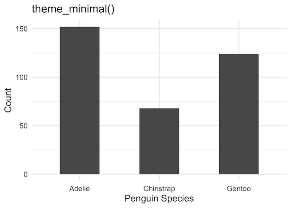
4. theme_minimal()
p +
  theme_minimal(16)+
  labs(title="theme_minimal()")
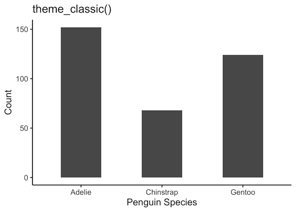
5. theme_classic()
p +
  theme_classic(16)+
  labs(title="theme_classic()")
6. theme_light()
p +
  theme_light(16)+
  labs(title="theme_light()")

There are a few more themes available in ggplot2. Check out here to learn what they are and how to use them.


