• Skip to primary navigation
  • Skip to main content
  • Skip to primary sidebar

Data Viz with Python and R

Learn to Make Plots in Python and R

  • Home
  • Python Viz
  • Seaborn
  • Altair
  • R Viz
  • ggplot2
  • About
    • Privacy Policy
  • Show Search
Hide Search

Four geoms in ggplot2 to visualize uncertainty

datavizpyr · September 20, 2023 ·

In this post, we will learn about four geoms in ggplot2 that are useful for revealing uncertainty in numerical variables with multiple categories. The four geoms, geom_errorbar(), geom_linerange(), geom_crossbar(), and geom_pointrange() are useful when we have categeorical x values and we are interested in the “distribution of y conditional on x and use the aesthetics ymin and ymax to determine the range of the y values”. The third edition of ggplot2 book has a great chapter describing these geoms.

Let us get started by loading tidyverse and palmer penguin pacakges.

library(tidyverse)
library(palmerpenguins)
theme_set(theme_bw(16))
df <- penguins %>%
  drop_na() %>%
  group_by(species) %>%
  summarize(n= n(),
            mean_body_mass= mean(body_mass_g),
            sd = sd(body_mass_g))
df

# A tibble: 3 × 4
  species       n mean_body_mass    sd
  <fct>     <int>          <dbl> <dbl>
1 Adelie      146          3706.  459.
2 Chinstrap    68          3733.  384.
3 Gentoo      119          5092.  501.

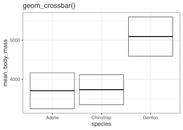
Visualizing Uncertainty with geom_crossbar()

df %>%
  ggplot(aes(species, mean_body_mass,
                  ymin = mean_body_mass - sd,
                  ymax = mean_body_mass + sd)) +
  geom_crossbar()
ggsave("visualizing_uncertainty_with_geom_crossbar.png")
Visualizing uncertainty with geom_crossbar()

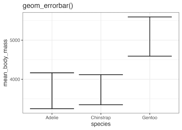
Visualizing Uncertainty with geom_errorbar()

df %>%
  ggplot(aes(species, mean_body_mass,
                  ymin = mean_body_mass - sd,
                  ymax = mean_body_mass + sd)) +
  geom_errorbar(linewidth = 1)
ggsave("visualizing_uncertainty_with_geom_errorbar.png")

Visualizing uncertainty with geom_errorbar()

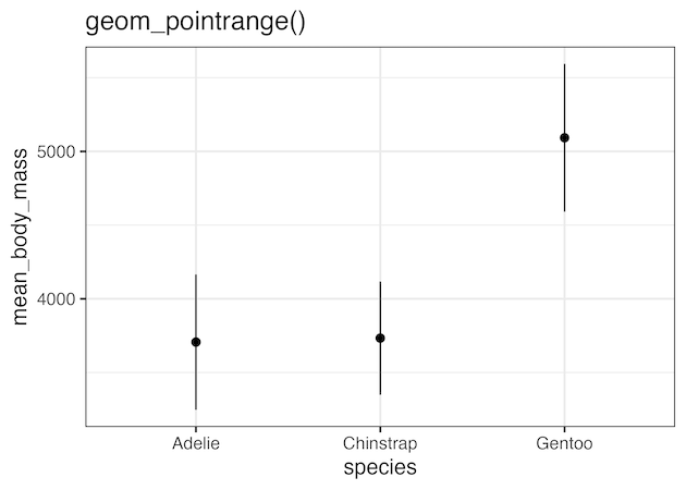
Visualizing Uncertainty with geom_pointrange()

df %>%
  ggplot(aes(species, mean_body_mass,
                  ymin = mean_body_mass - sd,
                  ymax = mean_body_mass + sd)) +
  geom_pointrange()
ggsave("visualizing_uncertainty_with_geom_pointrange.png")
Visualizing uncertainty with geom_pointange()

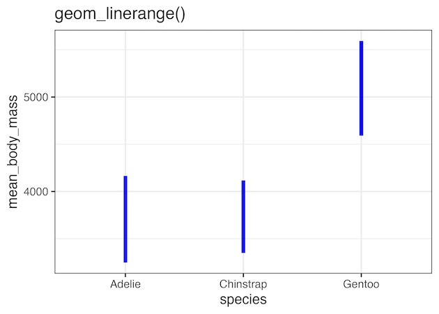
Visualizing Uncertainty with geom_linerange()

df %>%
  ggplot(aes(species, mean_body_mass,
                  ymin = mean_body_mass - sd,
                  ymax = mean_body_mass + sd)) +
  geom_linerange(color="blue", linewidth=2)
ggsave("visualizing_uncertainty_with_geom_linerange.png")
Visualizing uncertainty with geom_linerange()

Related posts:

Customizing Mean mark to boxplot with ggplot2How To Show Mean Value in Boxplots with ggplot2? Scatterplot with marginal multi-histogram with ggExtraHow To Make Scatterplot with Marginal Histograms in R? ggforce geom_circle(): Annotate with a circleHow To Annotate a Plot with Circle in R Default ThumbnailHow to Make Axis Text Bold in ggplot2

Filed Under: geom_errorbar(), geom_pointrange(), ggplot2, R Tagged With: geoms for visualizing uncertainty

Primary Sidebar

Tags

Altair barplot Boxplot boxplot python boxplot with jiitered text labels Bubble Plot Color Palette Countplot Density Plot Facet Plot gganimate ggplot2 ggplot2 Boxplot ggplot2 error ggplot boxplot ggridges ggtext element_markdown() Grouped Barplot R heatmap heatmaps Histogram Histograms Horizontal boxplot Python lollipop plot Maps Matplotlib Pandas patchwork pheatmap Pyhon Python R RColorBrewer reorder boxplot ggplot Ridgeline plot Scatter Plot Scatter Plot Altair Seaborn Seaborn Boxplot Stock Price Over Time Stripplot UpSetR Violinplot Violin Plot World Map ggplot2

Buy Me a Coffee

Copyright © 2025 · Daily Dish Pro on Genesis Framework · WordPress · Log in

Go to mobile version