
In this tutorial, we will learn how to make a donut plot in R using ggplot2. Donut plot is nothing but a bar plot, reshaped into pie-chart, and then adding a hole at the center to make it look like a donut. We will learn these in step by step manner to understand making Donut plot with ggplot2.
Let us load tidyverse.
library(tidyverse)
theme_set(theme_bw(16))
Let us create some sample data to make a Donut plot.
data <- tibble(
  category = c("Google", "Meta", "Apple", "Nvidia"),
  value = c(100, 120, 50, 150)
)

data

# A tibble: 4 × 2
  category value
  <chr>    <dbl>
1 Google     100
2 Meta       120
3 Apple       50
4 Nvidia     150
We will using proportion to make a Donut plot, so let us compute the proportion of each group of interest.
# Calculate the percentage and cumulative percentage
data <- data |>
  mutate(
    percentage = value / sum(value)
  )
data

# A tibble: 4 × 3
  category value percentage
  <chr>    <dbl>      <dbl>
1 Google     100      0.238
2 Meta       120      0.286
3 Apple       50      0.119
4 Nvidia     150      0.357
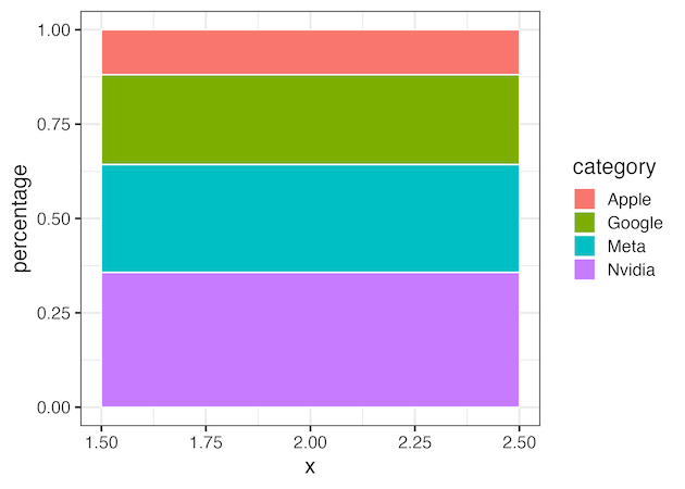
Making a Donut plot: Step 1
Now we have the data needed in hand, let us make bar plot using geom_bar() as the first step.
data |>
  ggplot(aes(x = 2, y = percentage, fill = category)) +
  geom_bar(stat = "identity", width = 1, color = "white")

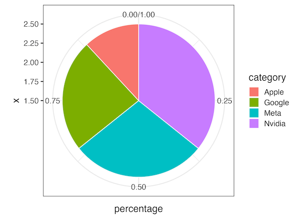
Making a Donut plot: Step 2
In second step, we use coord_polar() in ggplot2 to reshape the bars in barplot to pie-chart.
data |>
  ggplot(aes(x = 2,
             y = percentage,
             fill = category)) +
  geom_bar(stat = "identity",
           width = 1,
           color = "white") +
  coord_polar(theta = "y")
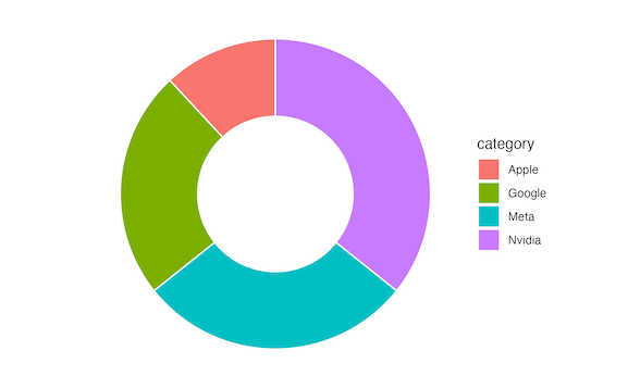
Making a Donut plot: Step 3
In the third step, we make a hole in the middle of the pie chart to make it look like a donut.
data |>
  ggplot(aes(x = 2,
             y = percentage,
             fill = category)) +
  geom_bar(stat = "identity",
           width = 1,
           color = "white") +
  coord_polar(theta = "y") +
  xlim(0.5, 2.5)   # Set limits to create a hole in the center

And finally, we can remove any thematic elements, just to keep only the Donut plot.
Making a Donut plot: Step 4
data |>
  ggplot(aes(x = 2,
             y = percentage,
             fill = category)) +
  geom_bar(stat = "identity",
           width = 1,
           color = "white") +
  coord_polar(theta = "y") +
  xlim(0.5, 2.5) +  # Set limits to create a hole in the center
  theme_void()
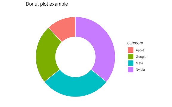
Finally we can add some title and other customization if needed just like any other plot with ggplot2.
data |>
  ggplot(aes(x = 2, y = percentage, fill = category)) +
  geom_bar(stat = "identity", width = 1, color = "white") +
  coord_polar(theta = "y") +
  xlim(0.5, 2.5) +
  theme_void() +
  labs(title="Donut plot example")
ggsave("how_to_make_donut_plot.png")
Explore the Complete ggplot2 Guide
35+ tutorials with code: scatterplots, boxplots, themes, annotations, facets, and more—tested and beginner-friendly.
Visit the ggplot2 Hub → No fluff—just code and visuals.


