• Skip to primary navigation
  • Skip to main content
  • Skip to primary sidebar

Data Viz with Python and R

Learn to Make Plots in Python and R

  • Home
  • Python Viz
  • Seaborn
  • Altair
  • R Viz
  • ggplot2
  • About
    • Privacy Policy
  • Show Search
Hide Search

How To Change ggplot2 theme?

datavizpyr · December 11, 2019 ·

ggplot2 offers 8 themes for making plots using ggplot2. By default, ggplot2 uses the grey theme. Here, we will examples of how to change the plot theme from the default grey ggplot2 theme. Let us first make a simple scatter plot with default grey ggplot theme
library(ggplot2)


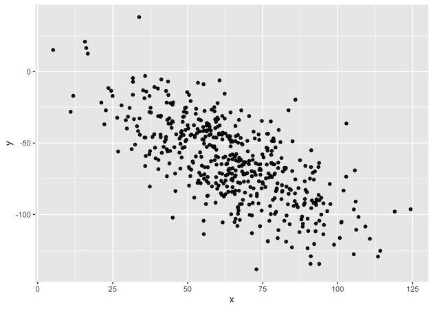
Let us create data frame with two variables to make a scatter plot in default ggplot2 theme.

x <- rnorm(500, mean=65, sd=20)
y <- rnorm(500, mean=2, sd=20) - x
df <- data.frame(x=x, y=y)
Let us create a simple scatter plot with default grey theme.
df %>% 
  ggplot(aes(x=x,y=y)) + geom_point()
Let us change the default theme to a simple black and white theme. ggplot2 black and white theme is called theme_bw(). Let us make the scatter in ggplot theme_bw()
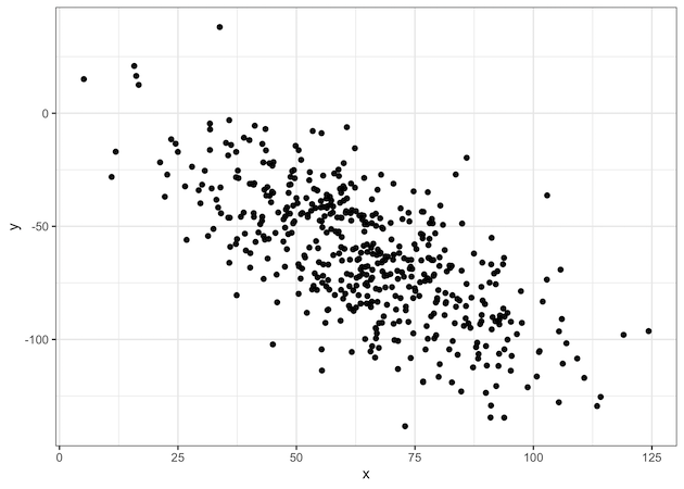
df %>% 
   ggplot(aes(x=x,y=y)) + geom_point()+  theme_bw()
ggplot black and white theme: theme_bw()

Related posts:

Dollar format ggplot2How to Add Dollar Symbol for Axis Labels with ggplot2? Customizing Labels on Bars in Side by side Stacked BarplotHow To Add Labels to Grouped Barplot with Bars Side-By-Side in R? Visualizing Missing Data with Barplot in R ggplot2Visualizing Missing Data with Barplot in R Annotate Clusters with Ellipse with Labels ggforceHow To Annotate Clusters with Circle/Ellipse by a Variable in R

Filed Under: ggplot2, ggplot2 theme, R Tagged With: ggplot2, R

Primary Sidebar

Tags

Altair barplot Boxplot boxplot python boxplot with jiitered text labels Bubble Plot Color Palette Countplot Density Plot Facet Plot gganimate ggplot2 ggplot2 Boxplot ggplot2 error ggplot boxplot ggridges ggtext element_markdown() Grouped Barplot R heatmap heatmaps Histogram Histograms Horizontal boxplot Python lollipop plot Maps Matplotlib Pandas patchwork pheatmap Pyhon Python R RColorBrewer reorder boxplot ggplot Ridgeline plot Scatter Plot Scatter Plot Altair Seaborn Seaborn Boxplot Stock Price Over Time Stripplot UpSetR Violinplot Violin Plot World Map ggplot2

Buy Me a Coffee

Copyright © 2025 · Daily Dish Pro on Genesis Framework · WordPress · Log in

Go to mobile version