• Skip to primary navigation
  • Skip to main content
  • Skip to primary sidebar

Data Viz with Python and R

Learn to Make Plots in Python and R

  • Home
  • Seaborn
  • Matplotlib
  • ggplot2
  • Altair
  • About
    • Privacy Policy
  • Visualizing Activation Functions in Neural Networks
  • Confusion Matrix Calculator
  • Visualizing Dropout Rate in Neural Network
  • Visualizing Loss Functions in Neural Networks
  • Show Search
Hide Search

R

How to make a plot with column name in a variable

datavizpyr · August 10, 2023 ·

Add color to ggplot using column name stored in a variable

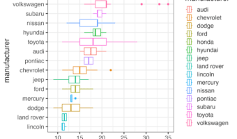
In this tutorial, we will learn how to make a plot using ggplot2 such that the column name of interest in a plot is saved as a variable. And we are interested in using the variable name to make a boxplot. The ability to use a column name as a variable help us make more … [Read more...] about How to make a plot with column name in a variable

Filed Under: ggplot2 Tagged With: ggplot with column name as variable

Multiple ways to remove legend in ggplot2

datavizpyr · April 19, 2023 ·

Four ways to remove legend in ggplot

Removing legends in ggplot2 is a common requirement when creating clean, professional data visualizations. While legends help identify different groups or categories, there are situations where they become redundant, clutter the plot, or aren't needed for your specific … [Read more...] about Multiple ways to remove legend in ggplot2

Filed Under: ggplot2, R Tagged With: remove ggplot2 legend

How to reverse legend key order in ggplot2

datavizpyr · January 19, 2023 ·

How to reverse legend key order in ggplot2

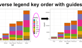
Reversing legend order in ggplot2 is essential for creating intuitive data visualizations where the legend arrangement matches your data hierarchy or presentation needs. By default, ggplot2 displays legend keys in alphabetical order, but often you'll want to reverse ggplot2 … [Read more...] about How to reverse legend key order in ggplot2

Filed Under: ggplot2, R, Uncategorized Tagged With: reverse legend key order

How to Increase Legend Key Size in ggplot2

datavizpyr · January 16, 2023 ·

How to Increase Color Legend's Point Size in ggplot2

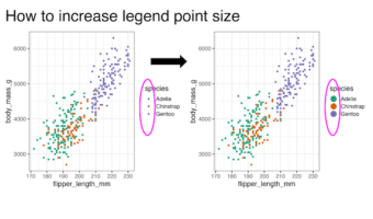
Learning how to increase legend key size in ggplot2 is essential for creating readable and professional data visualizations. When working with scatter plots containing multiple groups or using transparency (alpha), default legend keys can become too small or difficult to … [Read more...] about How to Increase Legend Key Size in ggplot2

Filed Under: ggplot2, R, Uncategorized Tagged With: ggplot2 guide_legend(), ggplot2 guides(), ggplot2 increase legend point size

Lollipop plot with ggplot extension ggalt

datavizpyr · January 4, 2023 ·

Customizing lollipop. plot with geom_lollipop() in ggalt

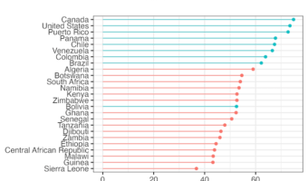
Creating a lollipop plot with ggalt is an excellent way to visualize ranked data with minimal ink usage compared to traditional bar charts. The ggalt package extends ggplot2 functionality with geom_lollipop(), making it easy to create elegant stick-and-circle visualizations that … [Read more...] about Lollipop plot with ggplot extension ggalt

Filed Under: ggplot2, R, Uncategorized Tagged With: geom_lollipop() ggalt, lollipop plot in R

  • « Go to Previous Page
  • Page 1
  • Interim pages omitted …
  • Page 6
  • Page 7
  • Page 8
  • Page 9
  • Page 10
  • Interim pages omitted …
  • Page 37
  • Go to Next Page »

Primary Sidebar

Python & R Viz Hubs

  • Seaborn Guide & Cookbook
  • ggplot2 Guide & Cookbook
  • Matplotlib Guide & Cookbook
  • Confusion Matrix Calculator
  • Visualizing Activation Functions
  • Visualizing Dropout
  • Visualizing Loss Functions

Buy Me a Coffee

Copyright © 2026 · Daily Dish Pro on Genesis Framework · WordPress · Log in

Go to mobile version