• Skip to primary navigation
  • Skip to main content
  • Skip to primary sidebar

Data Viz with Python and R

Learn to Make Plots in Python and R

  • Home
  • Python Viz
  • Seaborn
  • Altair
  • R Viz
  • ggplot2
  • About
    • Privacy Policy
  • Show Search
Hide Search

R

How to Reorder bars in barplot with ggplot2 in R

datavizpyr · December 23, 2019 ·

Descending order barplots in ggplot2

In this post, we will learn how to order bars in a barplot using ggplot2 in R. When we make barplot with ggplot2 on a character variable it places the group in alphabetical order. Here we will learn to use two functions, reorder() from base R and fct_reorder() function from … [Read more...] about How to Reorder bars in barplot with ggplot2 in R

Filed Under: barplot ggplot2, fct_reorder() barplot, R, reoprder barplot, reorder() barplot Tagged With: reorder barplot with fct_reorder, reorder barplots in R

How To Make Barplots with ggplot2 in R?

datavizpyr · December 21, 2019 ·

Simple Barplot with geom_col(): ggplot2

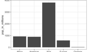
Barplots are a popular graphics that is widely used to show categorical data with retangular bars whose height represent the quantitative value the variable. In this post we will see multiple examples of making bar plots using ggplot2 in R. Let us first load tidyverse, a … [Read more...] about How To Make Barplots with ggplot2 in R?

Filed Under: barplot ggplot2, R Tagged With: ggplot2, R

How to Make Boxplots with ggplot2 in R?

datavizpyr · December 20, 2019 ·

Adjust Boxplot Line Thickness: ggplot2

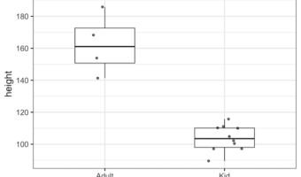
A boxplot is one of the simplest ways to summarize and visualize a distribution. Boxplots have been around for close to 50 years. The earliest form of Boxplot was invented by Mary Eleanor Spear as range plot and then John Tukey created box-and-whisker plot that uses quartiles of … [Read more...] about How to Make Boxplots with ggplot2 in R?

Filed Under: Boxplot ggplot2, R Tagged With: ggplot2, R

How To Change Axis Label, Set Title and Subtitle in ggplot2

datavizpyr · December 14, 2019 ·

How To Add Subtitle with ggplot2?

One of the key ingredients of a good plot is providing enough information on the plot to help convey the message in the plot. In this post we will examples of how to change x-axis and y-axis labels in a plot made with ggplot2 in R. And then we will see how to change axis … [Read more...] about How To Change Axis Label, Set Title and Subtitle in ggplot2

Filed Under: change axis label, change title ggplot2, ggplot2, R Tagged With: ggplot2, R

How To Change Axis Font Size with ggplot2 in R?

datavizpyr · December 13, 2019 ·

How to Increase axis fontsize ggplot2?

A plot or graphics made without legible x-axis and y-axis labels is a worthless plot. ggplot2 in R makes it easy to change the font size of axis labels. In this post, we will see examples of how to increase the font size of x and y-axis labels in R, including the tick mark … [Read more...] about How To Change Axis Font Size with ggplot2 in R?

Filed Under: change axis font size, ggplot2, R Tagged With: ggplot2, R

  • « Go to Previous Page
  • Page 1
  • Interim pages omitted …
  • Page 33
  • Page 34
  • Page 35
  • Page 36
  • Go to Next Page »

Primary Sidebar

Tags

Altair barplot Boxplot boxplot python boxplot with jiitered text labels Bubble Plot Color Palette Countplot Density Plot Facet Plot gganimate ggplot2 ggplot2 Boxplot ggplot2 error ggplot boxplot ggridges ggtext element_markdown() Grouped Barplot R heatmap heatmaps Histogram Histograms Horizontal boxplot Python lollipop plot Maps Matplotlib Pandas patchwork pheatmap Pyhon Python R RColorBrewer reorder boxplot ggplot Ridgeline plot Scatter Plot Scatter Plot Altair Seaborn Seaborn Boxplot Stock Price Over Time Stripplot UpSetR Violinplot Violin Plot World Map ggplot2

Buy Me a Coffee

Copyright © 2025 · Daily Dish Pro on Genesis Framework · WordPress · Log in

Go to mobile version