• Skip to primary navigation
  • Skip to main content
  • Skip to primary sidebar

Data Viz with Python and R

Learn to Make Plots in Python and R

  • Home
  • Python Viz
  • Seaborn
  • Altair
  • R Viz
  • ggplot2
  • About
    • Privacy Policy
  • Show Search
Hide Search

R

How To Remove facet_wrap Title Box in ggplot2?

datavizpyr · August 2, 2020 ·

Remove title box in facet_wrap() in ggplot2

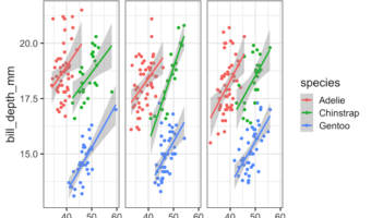
In this tutorial, we will see how to remove box surrounding title of each facets made with facet_wrap() function in ggplot2. Let us load tidyverse and set ggplot2 theme_bw() with base size 16. Let us use Palmer penguin dataset to make plots with facets using facet_wrap() in … [Read more...] about How To Remove facet_wrap Title Box in ggplot2?

Filed Under: facet_wrap ggplot2, facet_wrap remove box, R Tagged With: ggplot2, R

Violinplot vs Boxplot: Why Violinplot Is Better Than Boxplot

datavizpyr · July 30, 2020 ·

Violinplot of Data from 3 Different Distributions

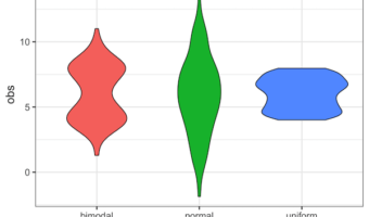
Violinplot or boxplot? What is better? Boxplots is great visualization to show a numerical variable. A boxplot shows "four main features about a variable: center, spread, asymmetry, and outliers". With the five summary statistics one can easily draw boxplot even by hand. Violin … [Read more...] about Violinplot vs Boxplot: Why Violinplot Is Better Than Boxplot

Filed Under: Boxplot ggplot2, Boxplot vs Violinplot, R, Violin plot ggplot2 Tagged With: boxplot vs violinplot, violin plot in R

How To Change facet_wrap() Box Color in ggplot2?

datavizpyr · July 21, 2020 ·

facet_wrap() example with white box

Facetting is a great way to show relationship between more than two variables. When you have three variables, with faceting one can splot a single plot into smaller plots with subset of data corresponding to the third variable. In ggplot2, we can easily make facetted plot using … [Read more...] about How To Change facet_wrap() Box Color in ggplot2?

Filed Under: facet_wrap box color, facet_wrap ggplot2, R Tagged With: ggplot2, R

How To Zoom in on a Plot in R?

datavizpyr · July 18, 2020 ·

How To Zoom In with ggplot2 in R?

While making data visualization, often you might want show a bigger level picture and then zoom in on part of the plot. In this tutorial, we will see an example of how to zoom in on a part of plot made with ggplot2 in R. The package, ggforce, made by fantastic Thomas Lin … [Read more...] about How To Zoom in on a Plot in R?

Filed Under: facet_zoom() ggforce, ggplot2, R, Zoom in ggplot2 Tagged With: ggplot2, R

How To Add Regression Line per Group to Scatterplot in ggplot2?

datavizpyr · July 11, 2020 ·

Add regression line per group without SE to scatterplot ggplot2.

In this tutorial, we will learn how to add regression lines per group to scatterplot in R using ggplot2. In ggplot2, we can add regression lines using geom_smooth() function as additional layer to an existing ggplot2. We will first start with adding a single regression to the … [Read more...] about How To Add Regression Line per Group to Scatterplot in ggplot2?

Filed Under: ggplot2, R, regression line per group Tagged With: ggplot2, R

  • « Go to Previous Page
  • Page 1
  • Interim pages omitted …
  • Page 22
  • Page 23
  • Page 24
  • Page 25
  • Page 26
  • Interim pages omitted …
  • Page 36
  • Go to Next Page »

Primary Sidebar

Tags

Altair barplot Boxplot boxplot python boxplot with jiitered text labels Bubble Plot Color Palette Countplot Density Plot Facet Plot gganimate ggplot2 ggplot2 Boxplot ggplot2 error ggplot boxplot ggridges ggtext element_markdown() Grouped Barplot R heatmap heatmaps Histogram Histograms Horizontal boxplot Python lollipop plot Maps Matplotlib Pandas patchwork pheatmap Pyhon Python R RColorBrewer reorder boxplot ggplot Ridgeline plot Scatter Plot Scatter Plot Altair Seaborn Seaborn Boxplot Stock Price Over Time Stripplot UpSetR Violinplot Violin Plot World Map ggplot2

Buy Me a Coffee

Copyright © 2025 · Daily Dish Pro on Genesis Framework · WordPress · Log in

Go to mobile version