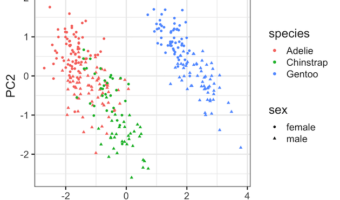
Principal Component Analysis (PCA) is one of the commonly used methods used for unsupervised learning. Making plots using the results from PCA is one of the best ways understand the PCA results. Earlier, we saw how to make Scree plot that shows the percent of variation explained … [Read more...] about How To Make PCA Plot with R
R
Sinaplot vs Violin plot: Why Sinaplot is better than Violinplot
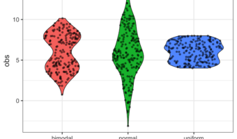
In this post, we will learn how to make Sinaplot in R and show why it is a better way visualize numerical data from multiple categories. In an earlier post, we discussed the benefits of making Violinplot than making a boxplot. This is mainly due to the fact that Boxplot relies … [Read more...] about Sinaplot vs Violin plot: Why Sinaplot is better than Violinplot
How to Make Grouped/Stacked Barplot in R?
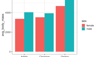
When you have dataset with two categorical variables and one quantitative variable, a grouped barplot is a great way to see the relationship among the variable. In a simple barplot, we have categorical variable on x-axis and have bars showing the numerical value of the … [Read more...] about How to Make Grouped/Stacked Barplot in R?
How to Change X and Y Axis Values from Real to Integers in ggplot2
When you make a plot with ggplot2, it automatically chooses appropriate range for x and y-axis values and it can be either floats or integers. In this post, we will see how to change X/Y-axis values to integers. In ggplot2, we can use scale_x_continuous() and scale_y_continuous() … [Read more...] about How to Change X and Y Axis Values from Real to Integers in ggplot2
How to Make Grouped Boxplot with Jittered Data Points in ggplot2
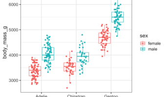
Grouped boxplots are excellent for comparing distributions across multiple categories, but they can hide important details about sample sizes and individual data points. By adding jittered points to your ggplot2 boxplot with points, you create more informative visualizations that … [Read more...] about How to Make Grouped Boxplot with Jittered Data Points in ggplot2