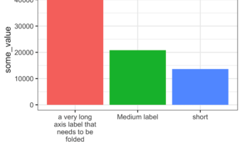
Dealing with long, overlapping axis labels that make your ggplot2 visualizations unreadable? This comprehensive guide shows you exactly how to wrap axis labels ggplot2 into multiple lines with ready-to-use code examples. Long axis labels are a common problem in data … [Read more...] about How to wrap long axis tick labels into multiple lines in ggplot2
R
How to Remove Space between Legend at Bottom and x-axis in ggplot2
Goal: This tutorial shows how to control the spacing around the ggplot2 legend—especially when the legend is placed at the bottom—and how to fine-tune multi-row legends. We begin with a reproducible baseline that illustrates the problem, then move through five practical fixes. … [Read more...] about How to Remove Space between Legend at Bottom and x-axis in ggplot2
How to add percentage label on bars in barplot with ggplot2
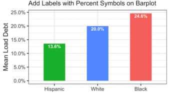
Adding percentage labels or count labels to bars in a barplot can help read the barplot quickly. In this tutorial, we will learn how to add labels with percentage symbol on bars in a barplot made with ggplot2 in R. Loading Packages and Dataset Let us get started by loading … [Read more...] about How to add percentage label on bars in barplot with ggplot2
Grouped Boxplots with reproducible jittered data points

In this post we will learn how to make a grouped boxplots with reproducible jittered points. We can make a grouped boxplot with jittered points using position_jitterdodge() function as position argument to geom_point(). Note that using the handy wrapper function … [Read more...] about Grouped Boxplots with reproducible jittered data points
How to make random jittered points reproducible

In this post we will learn how to make a random jitter plots made with ggplot2 reproducible. We have multiple posts on the importance of showing the actual data points while making boxplots/violinplots. One of the ways to avoid overplotting, is to add random jitters on the x-axis … [Read more...] about How to make random jittered points reproducible