• Skip to primary navigation
  • Skip to main content
  • Skip to primary sidebar

Data Viz with Python and R

Learn to Make Plots in Python and R

  • Home
  • Seaborn
  • Matplotlib
  • ggplot2
  • Altair
  • About
    • Privacy Policy
  • Visualizing Activation Functions in Neural Networks
  • Confusion Matrix Calculator
  • Visualizing Dropout Rate in Neural Network
  • Visualizing Loss Functions in Neural Networks
  • Show Search
Hide Search

R

Error in ggplot(): Mapping should be created with `aes()`

datavizpyr · July 17, 2022 ·

How to fix ggplot2 error: Mapping should be created with aes

In this post we will see an example of one of most common errors while making a plot with ggplot2 and how to fix them. Let us we are trying to make a scatter plot using ggplot2 using the following code. Here we use mtcars dataset built-in R to make the scatter … [Read more...] about Error in ggplot(): Mapping should be created with `aes()`

Filed Under: ggplot2, R Tagged With: ggplot2 error

ggplot2 errot: how to fix could not find function “ggplot

datavizpyr · July 7, 2022 ·

How to fix Error in ggplot(., aes... could not find function ggplot

In this post we will learn how to fix one of the most common ggplot2 errors, saying "could not find function "ggplot"" Let us consider an example where we are trying to make boxplot using iris, one of the R built-in datasets. We have been extra careful and write a … [Read more...] about ggplot2 errot: how to fix could not find function “ggplot

Filed Under: ggplot2, R Tagged With: ggplot2 error, how to fix could not find function ggplot

How to Make Grouped Violinplot with jittered data points in R

datavizpyr · July 3, 2022 ·

Grouped violin plot with jittered points using geom_sina() in ggforce

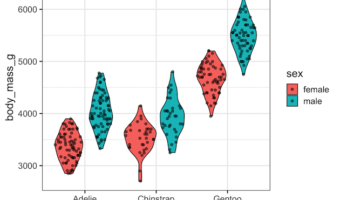
In this post, we will learn how to make grouped violin plot with jittered data points on top of it using ggplot2 in R. One of the challenges in making grouped violin or box plots with jittered data points is proper alignment of data points and the underlying plot. In an earlier … [Read more...] about How to Make Grouped Violinplot with jittered data points in R

Filed Under: geom_sina in ggforce, ggplot2, R Tagged With: Grouped violin plot with data points, Grouped violin plot with geom_sina()

How to Make Barplots with rounded edges in ggplot

datavizpyr · June 17, 2022 ·

barplot with rounded edge bars in ggplot2 with ggchicklet

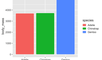
In this tutorial, we will learn how make bar plots with rounded edges in ggplot. We will use ggplot2 extension package called ggchicklet developed by the fantastic R developer boB Rudis/hrbrmstr. Let us get started by installing ggchicklet and loading tidyverse. We … [Read more...] about How to Make Barplots with rounded edges in ggplot

Filed Under: R Tagged With: barplot with rounded edge bars, ggchicklet rounded edge

Visualizing Binomial Distribution in R

datavizpyr · June 12, 2022 ·

Visualizing Binomial Distribution: Number of Successes vs PMF as bar plot

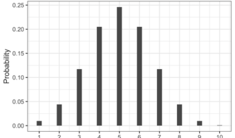
Introduction: Understanding and Visualizing the Binomial Distribution in R The binomial distribution is one of the most common discrete probability distributions in statistics. It models the number of successes in n independent Bernoulli trials, each with the same probability … [Read more...] about Visualizing Binomial Distribution in R

Filed Under: R Tagged With: Visualize Binomial Distribution

  • « Go to Previous Page
  • Page 1
  • Interim pages omitted …
  • Page 10
  • Page 11
  • Page 12
  • Page 13
  • Page 14
  • Interim pages omitted …
  • Page 37
  • Go to Next Page »

Primary Sidebar

Python & R Viz Hubs

  • Seaborn Guide & Cookbook
  • ggplot2 Guide & Cookbook
  • Matplotlib Guide & Cookbook
  • Confusion Matrix Calculator
  • Visualizing Activation Functions
  • Visualizing Dropout
  • Visualizing Loss Functions

Buy Me a Coffee

Copyright © 2026 · Daily Dish Pro on Genesis Framework · WordPress · Log in

Go to mobile version