• Skip to primary navigation
  • Skip to main content
  • Skip to primary sidebar

Data Viz with Python and R

Learn to Make Plots in Python and R

  • Home
  • Seaborn
  • Matplotlib
  • ggplot2
  • Altair
  • About
    • Privacy Policy
  • Visualizing Activation Functions in Neural Networks
  • Confusion Matrix Calculator
  • Visualizing Dropout Rate in Neural Network
  • Visualizing Loss Functions in Neural Networks
  • Show Search
Hide Search

maps ggplot2

How To Make World Map with ggplot2 in R?

datavizpyr · May 15, 2020 ·

Volcano locations on world map ggplot2

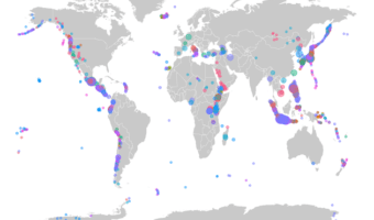
In this post, we will learn how to make world map using ggplot2 in R. We will use geom_map() function to make map with ggplot2. And then we will see an example of overlaying data on the world map. To overlay, we will use volcano eruption data from TidyTuesday project to … [Read more...] about How To Make World Map with ggplot2 in R?

Filed Under: R, World Map ggplot2 Tagged With: ggplot2, R, World Map ggplot2

How To Make US State and County Level Maps in R?

datavizpyr · March 16, 2020 ·

US State Level MMR Vaccination Rate

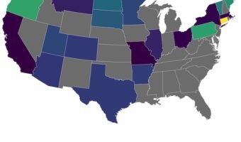
Creating maps is one of the most powerful ways to visualize data, and R's ggplot2 package makes it surprisingly straightforward. In this tutorial, you'll learn how to build beautiful and informative US maps from the ground up. We’ll guide you step-by-step through creating … [Read more...] about How To Make US State and County Level Maps in R?

Filed Under: ggplot2, maps ggplot2, R Tagged With: US Maps with ggplot2, US state maps ggplot2

Primary Sidebar

Python & R Viz Hubs

  • Seaborn Guide & Cookbook
  • ggplot2 Guide & Cookbook
  • Matplotlib Guide & Cookbook
  • Confusion Matrix Calculator
  • Visualizing Activation Functions
  • Visualizing Dropout
  • Visualizing Loss Functions

Buy Me a Coffee

Copyright © 2026 · Daily Dish Pro on Genesis Framework · WordPress · Log in

Go to mobile version