• Skip to primary navigation
  • Skip to main content
  • Skip to primary sidebar

Data Viz with Python and R

Learn to Make Plots in Python and R

  • Home
  • Seaborn
  • Matplotlib
  • ggplot2
  • Altair
  • About
    • Privacy Policy
  • Visualizing Activation Functions in Neural Networks
  • Confusion Matrix Calculator
  • Visualizing Dropout Rate in Neural Network
  • Visualizing Loss Functions in Neural Networks
  • Show Search
Hide Search

PCA plot

How To Make PCA Plot with R

datavizpyr · April 6, 2021 ·

PCA plot: PC1 vs PC2

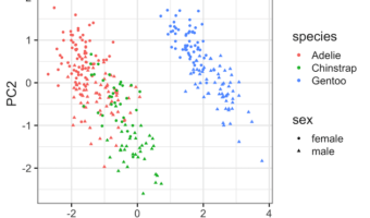
Principal Component Analysis (PCA) is one of the commonly used methods used for unsupervised learning. Making plots using the results from PCA is one of the best ways understand the PCA results. Earlier, we saw how to make Scree plot that shows the percent of variation explained … [Read more...] about How To Make PCA Plot with R

Filed Under: ggplot2, PCA plot, R Tagged With: ggplot2, R

Primary Sidebar

Python & R Viz Hubs

  • Seaborn Guide & Cookbook
  • ggplot2 Guide & Cookbook
  • Matplotlib Guide & Cookbook
  • Confusion Matrix Calculator
  • Visualizing Activation Functions
  • Visualizing Dropout
  • Visualizing Loss Functions

Buy Me a Coffee

Copyright © 2026 · Daily Dish Pro on Genesis Framework · WordPress · Log in

Go to mobile version