
Legends are useful to add additional variables to a data visualization. By default, when we make a plot with legend using ggplot2, it places the legend on outside the plot on the right side. In this post, we will learn how to change or adjust the legend position in ggplot2. We … [Read more...] about How To Adjust Legend Position in ggplot2?
ggplot2
How To Show Mean Value in Boxplots with ggplot2?

Boxplots are a great way to visualize multiple distributions using summary statistics. Boxplot shows five summary statistics; the minimum, the maximum, the median, and the first and third quartiles of the data. Sometimes, you might want to add other statistical summary values on … [Read more...] about How To Show Mean Value in Boxplots with ggplot2?
Connect Paired Points on Boxplots with Lines in ggplot2

Want to show relationships between paired observations or track changes across groups in your boxplots? This comprehensive guide shows you exactly how to connect points boxplot ggplot2 using lines, with practical examples for before/after studies, paired data, and longitudinal … [Read more...] about Connect Paired Points on Boxplots with Lines in ggplot2
How to Make ECDF Plot with ggplot2 in R?
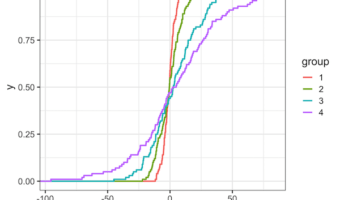
ECDF plot, a short for Empirical Cumulative Distribution Function Plot, is a great way to visualize one or more distributions. ECDF plot is a great alternative for histograms, as it does not suffer from the need of tuning parameter (bin size in histogram is a tuning parameter) … [Read more...] about How to Make ECDF Plot with ggplot2 in R?
ggpointdensity plot: A ggplot extension combining scatter plot with density plot
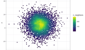
Scatterplots are great for visualizing relationship between two quantitative variables. However, it suffers from overplotting when the number of data points is large. Another solution is plot the density instead of actjual points. However, sometimes you might want to see the … [Read more...] about ggpointdensity plot: A ggplot extension combining scatter plot with density plot