Tired of your ggplot2 plots looking a little… off-balance? The default left-aligned title works, but for a polished, professional-looking chart, a centered title often makes all the difference. In this step-by-step tutorial, we'll show you the quick and easy way to perfectly … [Read more...] about Center Your ggplot2 Plot Titles and Subtitles in R
ggplot2
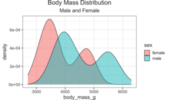
How to Highlight Select boxplot in ggplot2
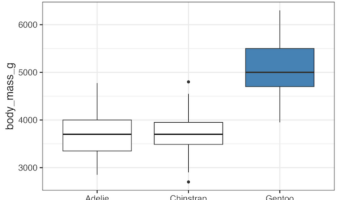
Need to emphasize specific groups or outliers in your boxplot visualizations? This comprehensive guide shows you exactly how to highlight and select boxplots in R using ggplot2, with step-by-step practical examples and customizable code snippets that work immediately. Boxplots … [Read more...] about How to Highlight Select boxplot in ggplot2
Visualizing Stock Price of Multiple Companies Over Time
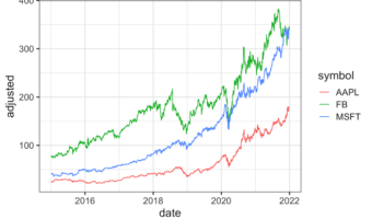
In this tutorial, we’ll explore how to visualize stock prices of multiple companies over time using R and ggplot2. Stock data is a classic example of time series data, where each company’s price changes over a period. We’ll start by retrieving stock prices for the companies … [Read more...] about Visualizing Stock Price of Multiple Companies Over Time
How to Order Months Chronologically in ggplot2 (Fixing Alphabetical Sort)
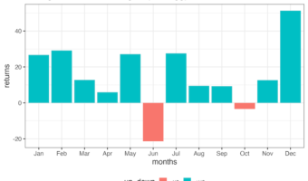
One of the most common frustrations for R beginners is plotting time-series data. You create a beautiful bar chart, but ggplot2 places April before January. Why does this happen? By default, R treats text variables (character strings) alphabetically. Since "A" comes before … [Read more...] about How to Order Months Chronologically in ggplot2 (Fixing Alphabetical Sort)
How to make axis tick label bold
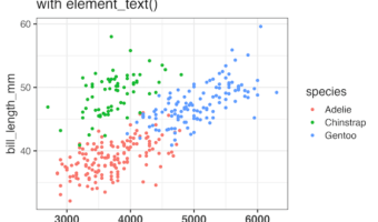
In this tutorial, you'll learn how to make axis tick labels bold in ggplot2 using the theme() function. Axis tick labels are the text that appears below x-axis and beside y-axis tick marks. Bold axis labels improve chart readability and make your data visualizations more … [Read more...] about How to make axis tick label bold