In this post we will learn how to change axis tick label size in ggplot2 with multiple example. When we make a plot with ggplot2, plots have axis ticks- small vertical bars on both x and y axis, and tick labels - right below the ticks. We can change the size of axis tick … [Read more...] about How to change axis tick label size in ggplot2
ggplot2
How to make rolling mean line plot of stock data
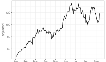
In this post we will learn how to make a moving average line plot of stock data, a great example of time series data. rolling_mean() function in zoo package can compute moving average of data of interest over a window size. For example, if we want to compute 7-day moving average, … [Read more...] about How to make rolling mean line plot of stock data
How to add P-value to each facet in ggplot2
In this tutorial, we will learn how to add p-value to each facet plot made with facet_wrap() function in ggplot2. We will use scatter plot example, where we have multiple scatter plots using facet_wrap and we have done linear regression analysis to find the statisitical … [Read more...] about How to add P-value to each facet in ggplot2
How to Annotate Positive and Negative Values in a barplot
In this post, we will learn how to properly annotate a bars barplot, where there are both positive and negative values/bars in ggplot2. In ggplot2, we can use gem_text() with label option to annotate text or bar heights on a barplot easily. However, when we have a barplot that … [Read more...] about How to Annotate Positive and Negative Values in a barplot
How to Annotate a plot with P-value in ggplot2
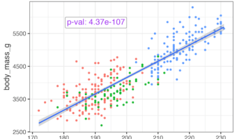
In this tutorial, we will learn how to add statistical significance to a plot made with ggplot2. Let us we have scatterplot to help understand the relation between two numerical variables and we have done linear regression analysis to find the statisitical significance of the … [Read more...] about How to Annotate a plot with P-value in ggplot2


