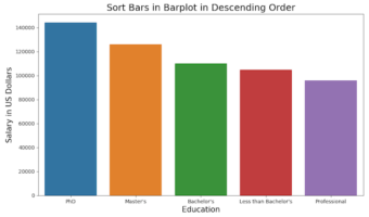
• Skip to primary navigation
  • Skip to main content
  • Skip to primary sidebar

Data Viz with Python and R

Learn to Make Plots in Python and R

  • Home
  • Python Viz
  • Seaborn
  • Altair
  • R Viz
  • ggplot2
  • About
    • Privacy Policy
  • Show Search
Hide Search

Seaborn

How To Order Bars in Barplot using Seaborn in Python?

datavizpyr · March 23, 2020 ·

Sort bars in barplot descending order with Seaborn Python

Barplots are great to visualize a quantitative value corresponding to categorical variables. Often it is more meaningful to make barplot sorted by the quantitative value corresponding to the bars. In this post, we will see examples of making barplot using Seaborn and sorting … [Read more...] about How To Order Bars in Barplot using Seaborn in Python?

Filed Under: Python, Sort Barplot Seaborn Tagged With: barplot, Order barplot in Seaborn, Python, Seaborn

How To Make Stripplot using Seaborn Catplot?

datavizpyr · March 20, 2020 ·

Stripplot using Seaborn Catplot with long data

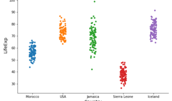
Stripplots are like scatter plots but one of the variables is a categorical variable. Stripplots are a great addition to boxplots as it shows complete data on the plot. Stripplots are more useful when can add random noise called "jitter" to avoid overlapping of data points with … [Read more...] about How To Make Stripplot using Seaborn Catplot?

Filed Under: Python, Stripplot Seaborn Catplot Tagged With: Python, Seaborn, Stripplot

How To Make Ridgeline plot in Python with Seaborn?

datavizpyr · March 9, 2020 ·

How to Make Ridgeline Plot in Python?

Ridgeline plots are great to visualize numerical distributions corresponding to multiple groups or categorical variables. Ridgeline plots make density plots or histograms for each group one on top of each other and thus making it look like "a mountain range". They are great for … [Read more...] about How To Make Ridgeline plot in Python with Seaborn?

Filed Under: Ridgeline plot Seaborn, Seaborn Tagged With: Python, Ridgeline plot, Seaborn

How To Use Seaborn Color Palette to Color Boxplot

datavizpyr · February 21, 2020 ·

Boxplot with Color Palette Set3 Seaborn

Adding right set of colors to plot can reveal a pattern that is not seen before. Seaborn Color Palettes makes it really easy to add group of suitable colors to your data visualization. In this post, we will learn how to use Seaborn Color Palettes to color a boxplot made with … [Read more...] about How To Use Seaborn Color Palette to Color Boxplot

Filed Under: Python, Seaborn Tagged With: color palette boxplot python, python boxplot specify colors

How to Make Horizontal Violin Plot with Seaborn in Python?

datavizpyr · February 14, 2020 ·

Horizontal Violin Plot with Catplot Seaborn

In this tutorial, we will learn how to make horizontal violin plot in Seaborn with Python. With Seaborn, we can use two similar functions, catplot() and violinplot() to make violin plots. Making a violinplot horizontal with Seaborn is pretty simple. All we need to do is specify … [Read more...] about How to Make Horizontal Violin Plot with Seaborn in Python?

Filed Under: Horizontal Violinplot Seaborn, Python, Seaborn Tagged With: Python, Seaborn, Violinplot

  • « Go to Previous Page
  • Page 1
  • Interim pages omitted …
  • Page 5
  • Page 6
  • Page 7
  • Page 8
  • Page 9
  • Page 10
  • Go to Next Page »

Primary Sidebar

Tags

Altair barplot Boxplot boxplot python boxplot with jiitered text labels Bubble Plot Color Palette Countplot Density Plot Facet Plot gganimate ggplot2 ggplot2 Boxplot ggplot2 error ggplot boxplot ggridges ggtext element_markdown() Grouped Barplot R heatmap heatmaps Histogram Histograms Horizontal boxplot Python lollipop plot Maps Matplotlib Pandas patchwork pheatmap Pyhon Python R RColorBrewer reorder boxplot ggplot Ridgeline plot Scatter Plot Scatter Plot Altair Seaborn Seaborn Boxplot Stock Price Over Time Stripplot UpSetR Violinplot Violin Plot World Map ggplot2

Buy Me a Coffee

Copyright © 2025 · Daily Dish Pro on Genesis Framework · WordPress · Log in

Go to mobile version