
Horizontal boxplots are useful when you have lots of groups with longer names. If you make simple boxplots, the longer names would overlap on each other and make it impossible to read the group names. Horizontal boxplots solve that problem easily. In this post, we will see an … [Read more...] about Horizontal Boxplots with Points using Seaborn in Python
Seaborn
How to Make Boxplots with Data Points using Seaborn in Python

Boxplot with data points on top of it is often better visualization technique than the boxplots alone. This is mainly because, boxplot with data points actually shows the data underlying the boxplots, while the boxplot alone just shows the summary statistics. Always remember, … [Read more...] about How to Make Boxplots with Data Points using Seaborn in Python
Change Axis Labels, Set Title and Figure Size to Plots with Seaborn
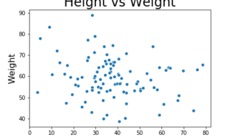
In this post we will see examples of how to change axis labels, how to increase the size of axis labels and how to set title for the plot made using Seaborn in Python. These three are most basic customizations a plot needs to make it useful. Let us load the packages we need to … [Read more...] about Change Axis Labels, Set Title and Figure Size to Plots with Seaborn
How to Make Pairplot with Seaborn in Python?

When you have multiple variables you might want to quickly look at how each variable is distributed and how each variable is related to other variables. Basically, we are interested in histograms of each variable and scatter plots for all pairs of variables. Seaborn's … [Read more...] about How to Make Pairplot with Seaborn in Python?
Coloring Boxplots with Seaborn Palettes

Boxplots made with Seaborn automatically gets colors by default. Sometimes you might want to change and assign different colors to the boxes in the boxplot. For example, one might want to color boxplots with colors that are colorblind friendly. One great solution to color the … [Read more...] about Coloring Boxplots with Seaborn Palettes