
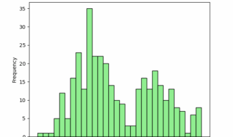
If you've ever stared at a column of numbers in a dataset and struggled to understand its underlying story, you're not alone. Raw data tells us little about the bigger picture. This is where the histogram shines. It's more than just a bar chart; it's your fastest tool for … [Read more...] about Histograms with Seaborn in Python
Python
How To Make Histograms with Matplotlib in Python?
If you've ever stared at a column of numbers in a dataset and struggled to understand its underlying story, you're not alone. While many libraries can create plots quickly, true mastery of Python visualization comes from understanding Matplotlib—the foundational engine that gives … [Read more...] about How To Make Histograms with Matplotlib in Python?
How to make Annotated heatmap with Seaborn in Python

In this tutorial, you’ll learn how to create an annotated heatmap in Python using Seaborn, a powerful data visualization library built on Matplotlib. We’ll start by generating a basic heatmap with the heatmap() function to visualize data in a color-coded grid. Then, we’ll take it … [Read more...] about How to make Annotated heatmap with Seaborn in Python
How to make Grouped barplots with Matplotlib in Python
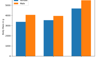
In this tutorial, we will learn how to make grouped barplot using Matplotlib in Python. We will learn how to make a gropued barplot in a realize scenario, where the data is in a Pandas dataframe and we have do some data munging to get the data to make grouped barplot. Let us … [Read more...] about How to make Grouped barplots with Matplotlib in Python
How to Add Text Annotations to Data Points in Python
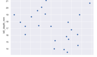
In this tutorial, we will learn how to add text annotations to all data points in a scatterplot made with Python. One of the easier ways to add text annotations to points in a scatter plot is to use Seaborn in Python. Seaborn Objects, a newer Seaborn API with grammar of graphics … [Read more...] about How to Add Text Annotations to Data Points in Python