• Skip to primary navigation
  • Skip to main content
  • Skip to primary sidebar

Data Viz with Python and R

Learn to Make Plots in Python and R

  • Home
  • Python Viz
  • Seaborn
  • Altair
  • R Viz
  • ggplot2
  • About
    • Privacy Policy
  • Show Search
Hide Search

ggplot2

Correlation Heatmap wiht Corrr

datavizpyr · August 21, 2022 ·

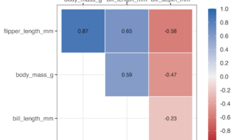
Correlation Heatmap with Correlation Annotated

In this post, we will learn how to make a simle correlation heatmap of numerical variables in a dataframe using Corrr R package. The R package Corrr starting from version 0.4.4 has a autoplot() function enables you to make simple correllation heatmap in addition to correlation … [Read more...] about Correlation Heatmap wiht Corrr

Filed Under: ggplot2, R Tagged With: Correlation Heatmap with Corrr, Corrr autoplot()

How to wrap really long facet label in R

datavizpyr · August 19, 2022 ·

How to wrap long facet labels: Hint use labeller

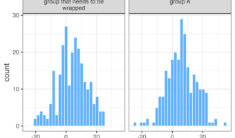
In this tutorial, we will learn how to wrap a really long labels in a facet plot made with ggplot2 using facet_wrap(). When the facet labels are too long, the label text gets cuts off. Here we will learn how can we fold or wrap the long facet labels into multiple lines so that … [Read more...] about How to wrap really long facet label in R

Filed Under: ggplot2, R Tagged With: labeller to wrap long facet label, wrap a long facet label

How to make stacked barplot with percent on x/y axis

datavizpyr · August 19, 2022 ·

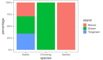
Stacked bar plot with percentage on y-axis

In this post we will see how to make a stacked barplot showing percentage on its axis instead of count or proportion. We can make stacked barplot with count or proportion directly using geom_bar() function in ggplot2. Then we will use scales R package to add percentage on the … [Read more...] about How to make stacked barplot with percent on x/y axis

Filed Under: ggplot2, R Tagged With: add percentage with scales, stacked barplot with percentage

Visualizing Correlation with tidymodels’ corrr package

datavizpyr · August 18, 2022 ·

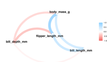
Correlation Network plot with corrr package

In this tutorial, we will learn examples of computing correlations among all the numerical variables in a dataframe and visualize the correlation in multiple ways. We will use Corrr package from tidymodels to compute the correlation and visualize the correlation. corrr is … [Read more...] about Visualizing Correlation with tidymodels’ corrr package

Filed Under: ggplot2, R Tagged With: Correlation as network plot, correlation plot with corrr, corrr package

ggplot2 error: how to fix error in dataframe

datavizpyr · August 17, 2022 ·

How to fix Error in dataframe

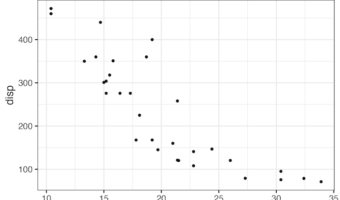
In this post we will learn under what circumstances we will see a ggplot2 error that says something like "replacement has 9 rows, data has 8" in addition to other text that is not easily understood. We will also see an easy fix to such a difficult sounding error. Let us … [Read more...] about ggplot2 error: how to fix error in dataframe
Filed Under: ggplot2, R Tagged With: ggplot2 error, How to fix Error in dataframe

  • « Go to Previous Page
  • Page 1
  • Interim pages omitted …
  • Page 7
  • Page 8
  • Page 9
  • Page 10
  • Page 11
  • Interim pages omitted …
  • Page 27
  • Go to Next Page »

Primary Sidebar

Tags

Altair barplot Boxplot boxplot python boxplot with jiitered text labels Bubble Plot Color Palette Countplot Density Plot Facet Plot gganimate ggplot2 ggplot2 Boxplot ggplot2 error ggplot boxplot ggridges ggtext element_markdown() Grouped Barplot R heatmap heatmaps Histogram Histograms Horizontal boxplot Python lollipop plot Maps Matplotlib Pandas patchwork pheatmap Pyhon Python R RColorBrewer reorder boxplot ggplot Ridgeline plot Scatter Plot Scatter Plot Altair Seaborn Seaborn Boxplot Stock Price Over Time Stripplot UpSetR Violinplot Violin Plot World Map ggplot2

Buy Me a Coffee

Copyright © 2025 · Daily Dish Pro on Genesis Framework · WordPress · Log in

Go to mobile version