• Skip to primary navigation
  • Skip to main content
  • Skip to primary sidebar

Data Viz with Python and R

Learn to Make Plots in Python and R

  • Home
  • Python Viz
  • Seaborn
  • Altair
  • R Viz
  • ggplot2
  • About
    • Privacy Policy
  • Show Search
Hide Search

ggplot2

Visualizing Stock Price of a Single Company Over Time

datavizpyr · November 5, 2021 ·

Month Name and Year with scale_x_date in ggplot2

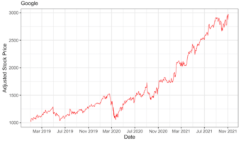
In this tutorial, we will learn how to visualize a company's stock price over time. Stock data is an example of time series data, where we have stock price of a company for a period of time. First, we will learn how to get stock price for a company of interest and use ggplot2 to … [Read more...] about Visualizing Stock Price of a Single Company Over Time

Filed Under: ggplot2, R Tagged With: Stock Price Over Time, Time Series Plot ggplot2

How to Highlight Groups with Convex Hull in ggplot2

datavizpyr · September 28, 2021 ·

Highlighting Groups in a plot with Convex Hull in R

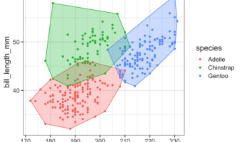
In this tutorial, we will learn how to annotate or add colors to multiple groups in a scatter plot made with ggplot2 in R using convex hull shapes. Convex hull is basically a box or polygon connecting the outermost data points for each group in a scatter plot with multiple … [Read more...] about How to Highlight Groups with Convex Hull in ggplot2

Filed Under: ggplot2, R Tagged With: convex hull ggplot2, highlight groups with convex hull

How to Center Plot Title in ggplot2

datavizpyr · September 14, 2021 ·

Move title and subtitle to the center of ggplot

In this tutorial, we will learn one of the most basic and useful tip to place the title (and subtitle) of a plot to center using ggplot2. When we add title to a plot made with ggplot2, it places the title left aligned to the plot by default. Sometimes you might want to place the … [Read more...] about How to Center Plot Title in ggplot2

Filed Under: ggplot2, R Tagged With: move subtitle to the center ggplot2, move title to the center ggplot2

Side by side plots with ggplot2 using gridExtra

datavizpyr · September 13, 2021 ·

Combine two plots made with ggplot2 side by side using gridExtra

In this tutorial, we will learn how to place two plots made with ggplot2 side by side. In R, we have multiple solutions to combine plots into a single plot. Here, we will use R Package gridExtra's function grid.arrange to combine two plots side by side. Firs, let us load the … [Read more...] about Side by side plots with ggplot2 using gridExtra

Filed Under: ggplot2, R Tagged With: gridExtra grid.arrange, side by side plot ggplot2

How to Make Axis Title Bold Font with ggplot2

datavizpyr · September 6, 2021 ·

Make Axis Title Bold Font with element_text()

In this tutorial, we will learn how to change the axis title bold font with ggplot2 in R. Let us load the packages needed including tidyverse and palmerpenguins for penguins data. A plot with default font for axis title text Let us make a simple scatter plot using … [Read more...] about How to Make Axis Title Bold Font with ggplot2

Filed Under: ggplot2, R Tagged With: axis title bold element_text, axis title bold ggplot2

  • « Go to Previous Page
  • Page 1
  • Interim pages omitted …
  • Page 12
  • Page 13
  • Page 14
  • Page 15
  • Page 16
  • Interim pages omitted …
  • Page 27
  • Go to Next Page »

Primary Sidebar

Tags

Altair barplot Boxplot boxplot python boxplot with jiitered text labels Bubble Plot Color Palette Countplot Density Plot Facet Plot gganimate ggplot2 ggplot2 Boxplot ggplot2 error ggplot boxplot ggridges ggtext element_markdown() Grouped Barplot R heatmap heatmaps Histogram Histograms Horizontal boxplot Python lollipop plot Maps Matplotlib Pandas patchwork pheatmap Pyhon Python R RColorBrewer reorder boxplot ggplot Ridgeline plot Scatter Plot Scatter Plot Altair Seaborn Seaborn Boxplot Stock Price Over Time Stripplot UpSetR Violinplot Violin Plot World Map ggplot2

Buy Me a Coffee

Copyright © 2025 · Daily Dish Pro on Genesis Framework · WordPress · Log in

Go to mobile version