Last updated on December 19, 2020
Barplots are a popular graphics that is widely used to show categorical data with retangular bars whose height represent the quantitative value the variable.
In this post we will see multiple examples of making bar plots using ggplot2 in R.
Let us first load tidyverse, a suite of R packages including ggplot2. We will use gapminder data to make the barplots. We can access the gapminder data using the gapminder package. Otherwise one can access the data from Carpentries http://bit.ly/2cLzoxH
We will also set the ggplot2 theme to theme_bw() with base_size=16. This helps us set the theme once and have it for all the plots that we make.
library(tidyverse)
library(gapminder)
theme_set(theme_bw(base_size=16))
And the gapminder data looks like this with over 6000 rows.
head(gapminder)

## # A tibble: 6 x 6
##   country     continent  year lifeExp      pop gdpPercap
##   <fct>       <fct>     <int>   <dbl>    <int>     <dbl>
## 1 Afghanistan Asia       1952    28.8  8425333      779.
## 2 Afghanistan Asia       1957    30.3  9240934      821.
## 3 Afghanistan Asia       1962    32.0 10267083      853.
Barplots with ggplot2
One can make bar plots using two geoms in ggplot2. One way to make bar plot is to use geom_col() and the second way to make barchart is to use the function geom_bar().
geom_col() vs geom_bar() in ggplot
There is a subtle difference between them. geom_col() is a simpler function that makes a barplot using the data given as such and it does not modify the data. geom_col() function is useful when you want the heights of the bars to be the actual data.
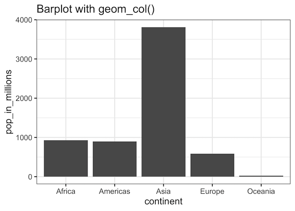
For example, if we have a dataframe with population size for each continent, geom_col() is perfect to make a barplot with all the continents and the height representing the population size.
Let us use gapminder data to compute population size – population in millions, for the year 2007 for each continent.
We first filter our data for the year 2007 and compute total population per continent using group_by() function and summarize() function as follows.
pop_df <- gapminder %>%
  filter(year==2007)%>%
  group_by(continent) %>%
  summarize(pop_in_millions=sum(pop)/1e06)
Now we have the dataframe we need. We can use geom_col() function in ggplot2 to make a simple bar plot. We provide the aesthetics that want to plot on x and y axes from the data and simply add geom_col() layer to it.
pop_df %>%
  ggplot(aes(continent, pop_in_millions))+
  geom_col()
And this is how the simple barplot we made looks like.
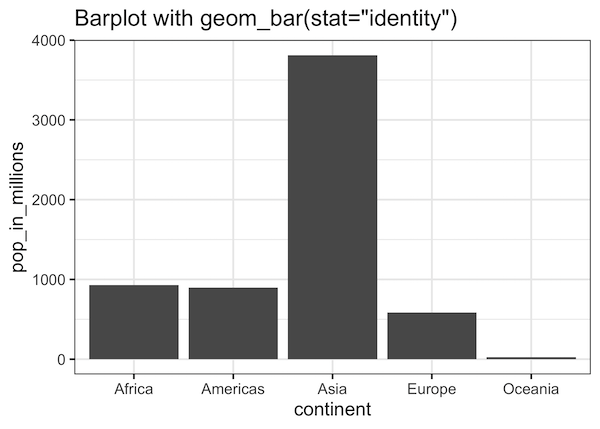
Barplots with geom_bar(): Overcoming Error: stat_count()
The second way to make bar plot with ggplot2 is to use geom_bar(). Let us try to make the same plot using the geom_bar() function by simply adding geom_bar() as a layer to the aesthetics layer.
pop_df %>%
  ggplot(aes(continent,pop_in_millions))+
  geom_bar()
If you try to execute the above code chunk, you will get an error like
Error: stat_count() must not be used with a y aesthetic.
We get the stat_count() error because, by default geom_bar() uses stat_count(). Basically, it counts the number of cases for each value of categorical variable. Here we don’t need that as we have already made the computation with group_by() and summarize() function earlier.
To make barplots with geom_bar(), we need to change the default stat to “identity”. Which tells the function that don’t compute anything. Then we would get the same barplot that we got using geom_col().
pop_df %>%
  ggplot(aes(continent,pop_in_millions))+
  geom_bar(stat="identity")
Then we would get exactly the same barplot that we got using geom_col().
We can also use geom_bar() function with weight argument to make the same plot but with the original gapminder data instead of the derived data as we did. The idea is to use weight option to weigh each continent’s count with their population millions.
gapminder %>%
  filter(year==2007) %>%
  ggplot(aes(continent)) +
  geom_bar(aes(weight=pop/1e6))
And we get the same barplot as before. Now that we have made the same barplots in three different ways.
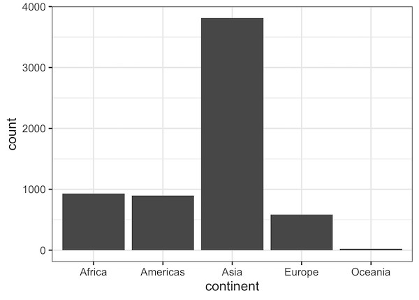
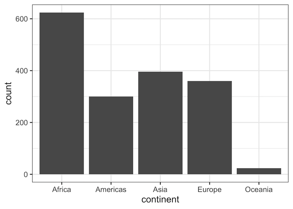
Another we can use geom_bar() function with the default stat_count() option is to get the counts of a categorical variable of interest. And use it to make barplot with counts as the size the bars in bar plots.
gapminder %>%
  ggplot(aes(continent)) +
  geom_bar()
This creates a barplots with number of entries of each continent, in this example, number of countries per continent as bar plot.