Last updated on July 13, 2022
In this post, we will learn how to make a barplot with error bar using ggplot2 in R. Barplot alone is useful to display counts for multiple categories. However, often there may be uncertainty around the count values and we could represent as error bar on the barplot.
Let us load tidyverse packages.
library(tidyverse)
We will use Stack Overflow survey results 2019 data to make barplots with error bar.
stackoverflow_file <- "https://raw.githubusercontent.com/datavizpyr/data/master/SO_data_2019/StackOverflow_survey_filtered_subsampled_2019.csv"

survey_results <- read_csv(stackoverflow_file)
## Parsed with column specification:
## cols(
##   CompTotal = col_double(),
##   Gender = col_character(),
##   Manager = col_character(),
##   YearsCode = col_character(),
##   Age1stCode = col_character(),
##   YearsCodePro = col_character(),
##   Education = col_character()
## )
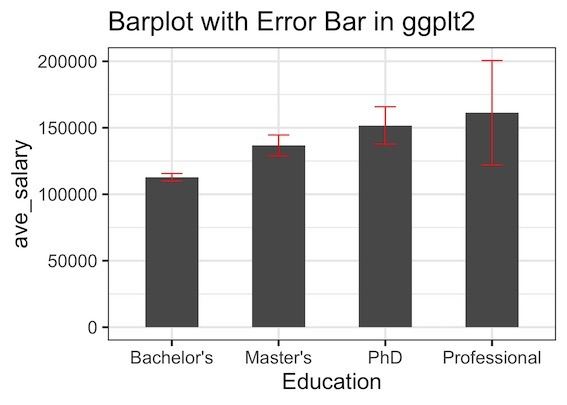
We will make barplot salary with standard error for five educational categories from the survey data.
survey_results %>% head()

## # A tibble: 6 x 7
##   CompTotal Gender Manager YearsCode Age1stCode YearsCodePro Education
##       <dbl> <chr>  <chr>   <chr>     <chr>      <chr>        <chr>
## 1    180000 Man    IC      25        17         20           Master's
## 2     55000 Man    IC      5         18         3            Bachelor's
## 3     77000 Man    IC      6         19         2            Bachelor's
## 4     67017 Man    IC      4         20         1            Bachelor's
## 5     90000 Man    IC      6         26         4            Less than bachelor…
## 6     58000 Man    IC      16        14         4            Bachelor's
In order to make, barplot with error bar we need to compute mean salary and standard error. We will clean up the data data bit with ignoring rows with NA values and ignore education level lower than Bachelor’s degree. Also, we will sample 1000 observations for this barplot with error bar example.
We will compute mean salary and SE, by grouping the data by Education and using summarize() function in dplyr.
set.seed(412)
df <- survey_results %>%
  filter(!is.na(Education)) %>%
  sample_n(1000) %>%
  filter(Education !="Less than bachelor's")%>%
  group_by(Education) %>%
  summarize(ave_salary = mean(CompTotal),
            se = sd(CompTotal)/sqrt(n()))
Now we have the data we need to make the barplot with error bar. Note for each educational category, we have bothe mean salary and standard error accounting for the sample variability in salary.
df
## # A tibble: 5 x 3
##   Education            ave_salary     se
##   <chr>                     <dbl>  <dbl>
## 1 Bachelor's              112790.  2835.
## 2 Less than bachelor's    114941.  6529.
## 3 Master's                136773.  7793.
## 4 PhD                     151719. 14113.
## 5 Professional            161333. 39265.
To make barplot with error bars, we first make bar plot as usual with geom_col() function. And then add the errorbar using geom_errorbar() as additional layer. The geom_errorbar() function has its own aes() function containing minimum and maximum values of y computed using mean and SE of salary.
df %>%
  ggplot(aes(x = Education, y = ave_salary)) +
  geom_col(width=0.5)+
  #stat_summary(fun.y = mean, geom = "bar") +
  geom_errorbar(aes(ymin=ave_salary-se,
                    ymax=ave_salary+se),
                width=.2, # Width of the error bars
                position=position_dodge(.9),
                color="red")
In this barplot with error bars, we color the error bars in red.